UX Case Study · AI SaaS Product · Zero to One · 2023–Present
Building a product
nobody had yet
designed.
When I joined Promptcore, ContentEngine was a concept in an Excel sheet and a rough developer interface. Eighteen months later it’s a live AI-powered SaaS platform with a personalized dashboard, an events newsfeed, an AI AutoDraft flow, a full content editor, and a brand customization system. Working closely with the CEO and dev team, I led the design of the entire product from the ground up.
My Role
Head of UX/UI Design
Company
Promptcore
Product
ContentEngine
Type
Zero-to-one product design
01 · What I Walked Into
A developer console
wearing a product's clothes.
The concept was genuinely interesting: users set up interest alerts based on RSS feeds or Reddit channels etc., the AI scrapes the internet for relevant content, and surfaces it as a report the user can act on. A smart content intelligence tool for creators and marketers.
My first task was to understand the product deeply enough to design it well. What the development team had built was a technical foundation tool cards showing average run times and last-run dates, a results table with Run IDs, token counts, and LLM costs. It was a strong starting point for engineers, but it needed significant translation before it could serve the content creators and marketers the product was built for.
● Before
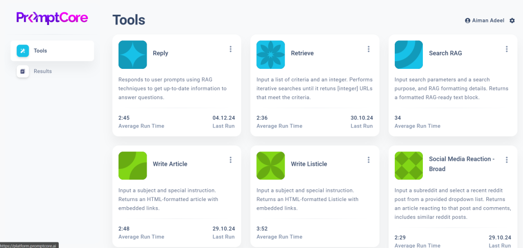
The Tools page. Six tool cards showing average run times and last-run dates. A clear and functional interface for the engineering layer of the platform.
● Before
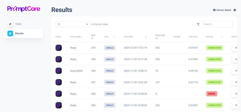
The Results page. A data table showing Run IDs, datetime stamps, token counts, LLM costs, and status. The raw output layer that needed a user-friendly experience designed around it.
“In a startup moving fast, UX process has to prove its value. So I made sure it did, by doing the work that made the product better, and showing why it mattered.”
02 · Laying the Foundation
Mapping the system
before building on it.
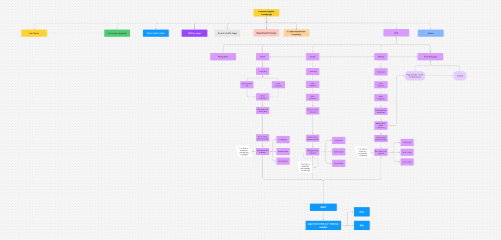
One of my first contributions was to build a shared picture of how the product worked as a whole. I createdFull user flow diagrams for every major area:
- The homepage navigation structure,
- The content generation flow from alert creation through to export,
- Batch run journeys,
- The overall site architecture.
Having this foundation in place meant every subsequent design decision could be made in context.
The annotated wireframes that followed became a working language between design and development The yellow sticky notes are an example showing the collaborative process in action, flagging open questions and dependencies that needed resolution before screens could be finalized.
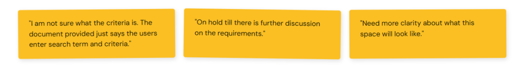
↑ Actual annotation notes from wireframes, that kept the team aligned on what still needed to be defined.
Full product user flow
The complete path from homepage through alerts, AI content generation, template selection, content editing, and publishing across email, Slack, and web. Built before any screen was designed.
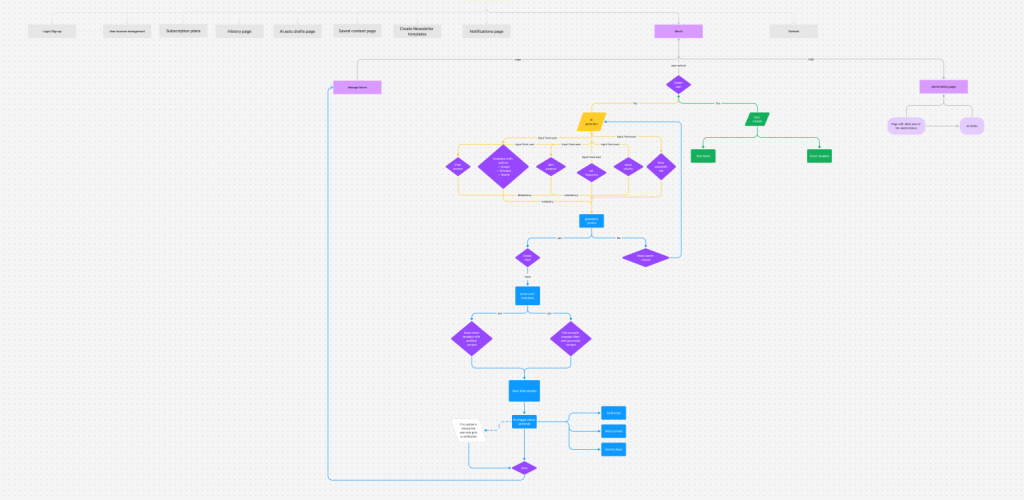
Complete site map & alerts flow
Every section of the platform mapped: Login, Account Management, Subscription, History, AI AutoDrafts, Saved Content, Newsletter Templates, Alerts, Contact. Plus the full alert creation flow for Reddit, Google, and Scoop.
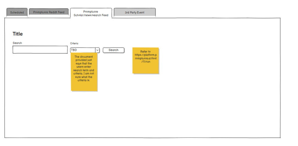
Alert creation wireframes
Four tabbed alert types — Scheduled, Reddit Feed, Scholar/News Search, 3rd Party Event — each with its own input requirements. Yellow sticky notes document unresolved questions throughout.
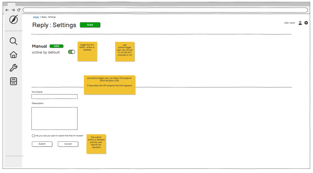
Settings page wireframes
Detailed annotations for every interaction — toggle states, conditional field appearance, submit button disabled states. These specs gave the dev team the clarity needed to build each interaction accurately.
03 · A Shared Decision That Changed the Product
Turning a data table into a newsfeed.
The original product vision was to surface AI-scraped content as a results table.
I identified a key opportunity: content creators don’t browse tables they scroll feeds.
They scan headlines, react to thumbnails, and respond to recency. A feed would do the work the table was asking users to do themselves. I brought this perspective to the team with research and user behavior evidence showing how a feed model would reduce the cognitive load between “I see a relevant event” and “I click AI AutoDraft.” The team aligned on the approach and it became the product’s defining design direction.
● Before — Raw results table
Run IDs. Token counts. LLM costs. The user had to mentally translate data rows into content opportunities — every row required interpretation before any action was possible.
● After — Events newsfeed
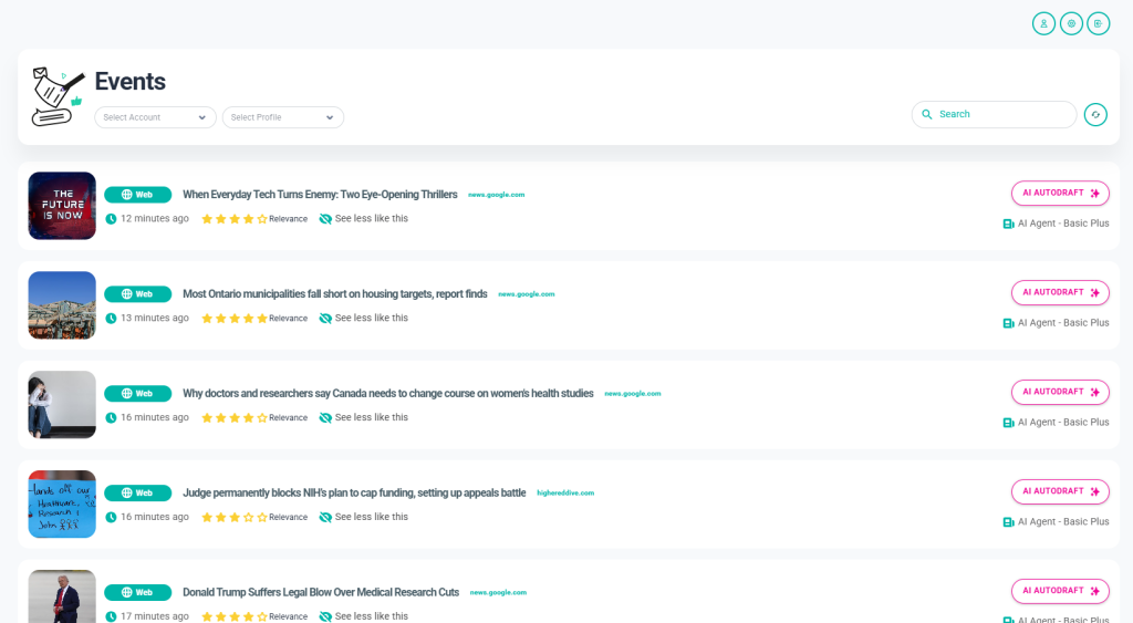
Thumbnail. Headline. Source. Time. Relevance rating. Content type badge. One button — AI AUTODRAFT — visible on every card without any translation required.
The events feed became the centrepiece of the product. Every design decision in it was deliberate:
- The content type badges (Post, Video, Popular) let users filter visually;
- The relevance star rating gave users a signal before they committed to reading;
- “See less like this” introduced a feedback loop that would improve results over time.
- The AI AutoDraft button — prominent, always visible — removed every barrier between discovery and action.
04 · The Product
Eighteen months of
design decisions.
ContentEngine is not a single screen or a single flow. It’s a complete SaaS platform, built collaboratively over eighteen months. What follows is the product as it stands today every screen designed in close partnership with the CEO and dev team. Every decision was backed by competitive research and data.
01
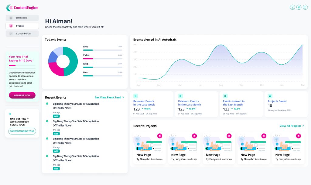
Dashboard — The Command Centre
A personalised home screen that surfaces everything a user needs at a glance. The dashboard includes:
- Today’s Events breakdown by content type
- An Events viewed in AI AutoDraft line chart showing usage trends over time
- A Recent Events list linked directly to the feed
- KPI cards showing relevant events this week and month, plus projects saved
- Recent Projects for quick access to ongoing work
02
Events Feed — From Table To Newsfeed
The product’s centrepiece, shaped through close collaboration between design and the broader team. Each event card contains:
- A thumbnail, content type badge (Post, Video, Popular), headline, source domain and timestamp
- A relevance star rating and “See less like this” feedback control
- The AI AUTODRAFT button, prominently placed for one-click content generation
03
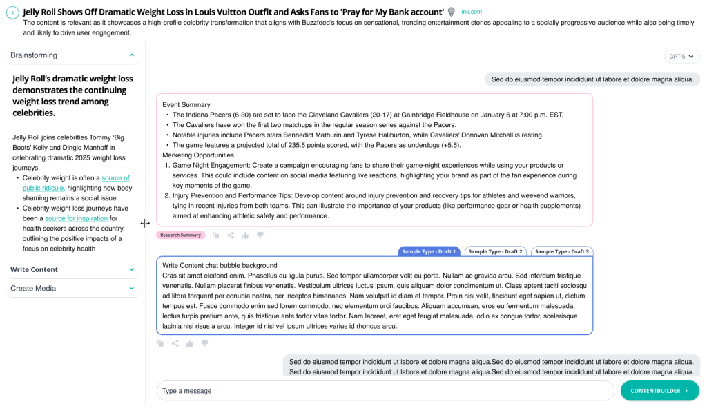
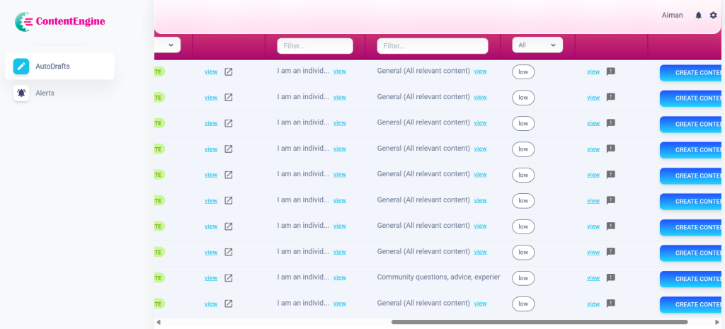
AI-Autodrafts — From Table To A Screen With Multiple functions
The most iterated screen in the product and the one that mattered most. The left accordion walks users through a clear sequential flow:
- Brainstorming surfaces AI-generated angles and perspectives on the event
- Write Content opens the live chat agent where users can direct, refine, and iterate on their draft in real time
- Create Media handles the final output
Three draft type tabs at the top let users switch between content formats without losing their work. The right panel gives maximum visual space to the content being written, with the chat interface, generated draft, and feedback controls all within reach. A Research Summary tag anchors the context so users never lose sight of the event they started with.
04
Posts — The Content Library
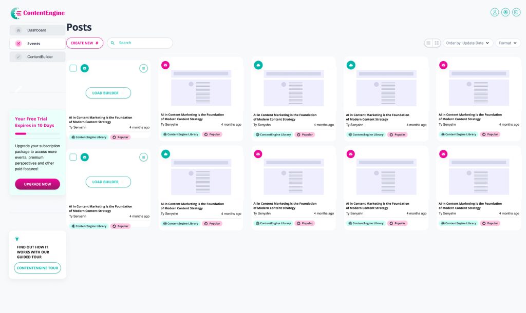
The content library where every piece of generated content lives. The grid view displays each post as a card containing:
- A format type badge (email, web, social) identifying the content type at a glance
- A thumbnail preview of the generated content
- The post title, author, and creation date
- Tags showing content origin, including ContentEngine Library and Popular labels
A search bar and Format filter let users find specific content quickly. The Order by Update Date control keeps the most recent work surfaced at the top. Grid and list view toggles let users choose how they browse. The CREATE NEW button with a lightning bolt icon sits as the clear primary action, and the Load Builder option on draft cards lets users jump straight back into editing any unfinished piece.
05
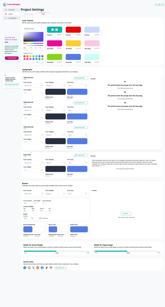
Project Settings — Full Brand Customization
One of the most complex screens in the product, giving users complete control over how their brand appears across every piece of content ContentEngine generates. The settings are organised into four areas:
- Colour Palette lets users define and name their primary and secondary brand colours using a live colour picker with hex input and suggested colour swatches
- Typography covers H1, H2, H3 and body text, with controls for font family, weight, size, line height, default colour and link colour, each with a live preview
- Button customisation covers font, corner radius, line height, letter spacing, content padding, border settings, background colour, hover colour and border colour, all with a live preview
- Width controls for both email and page design ensure content renders correctly across different email clients and screen sizes
- A Social Links section at the bottom lets users connect their brand accounts for use across generated content.
Every setting here ensures that content produced through ContentEngine outputs in the user’s brand, not ContentEngine’s defaults.
05 · The AI AutoDraft Modal
The most iterated screen
in the product.
The AI AutoDraft modal is the most critical interaction in ContentEngine, the moment a user moves from discovering a trending event to generating content they can actually publish. It’s also the screen I redesigned more times than any other, across at least seven distinct major iterations over eighteen months.
Each version was a response to a real problem:
- Users not knowing where to start, the research overwhelming the generation step,
- Not enough space to actually see the content being written.
- And so much more (discussed below)
The iterations weren’t arbitrary they were the product learning what it needed to be.
v1
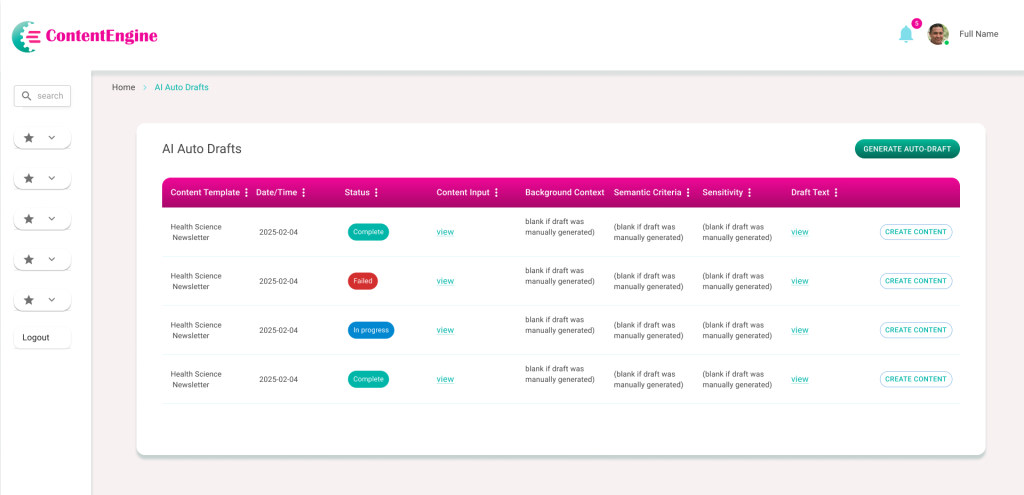
Initial AI Auto-Drafts Table
Complex data table with hidden content and navigation friction.
The first iteration presented AI-generated content in a rigid tabular format. While it provided a centralized log, significant UX/UI limitations hindered user efficiency. Key information was buried behind “view” links, and the lack of descriptive navigation left users with no context for their workflow. The path from reviewing a draft to publishing content was fragmented and unclear.
Poor Discoverability: Critical ‘Content Input’ and ‘Draft Text’ are hidden behind clicks, preventing quick scanning.
High Visual Noise: Columns like ‘Background Context’ show repetitive instructional text rather than useful data.
Vague Navigation: The sidebar uses non-descriptive icons, forcing users to rely on trial and error.
Weak Information Scent: Users must open every row to know which items require immediate action.
Suboptimal Hierarchy: Primary and secondary action buttons have conflicting visual weight and poor alignment.
Accessibility Gaps: Low-contrast headers and a lack of status icons make the table difficult to navigate for all users.
v2
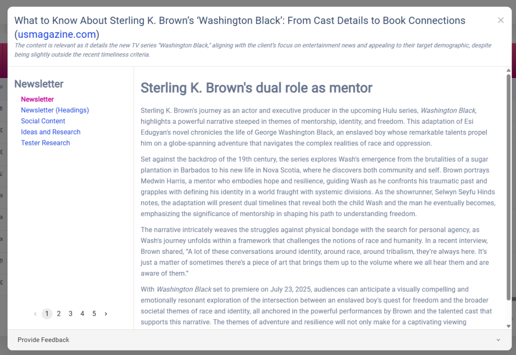
Content Preview & Multi-Perspective View
Transitioning from a data log to a reader-centric interface.
The second iteration moved away from a rigid table to a focused “Article View.” By pulling the content out from behind links, users could finally read and evaluate AI drafts immediately. I introduced a left-hand navigation to toggle between different content types (Newsletter, Social, etc.) and a pagination system to explore multiple AI-generated perspectives. While this improved readability, it created a new challenge: the interface felt like a static “reader” rather than a “creator” tool, leaving the next steps in the publishing workflow ambiguous.
Context Overload: The header text (rationale for the article) is helpful but lacks visual separation from the actual draft content, causing cognitive load.
Navigation Ambiguity: While the sidebar categories are clearer, the relationship between the “Newsletter” types and the pagination (1–5) isn’t immediately intuitive.
Static Interaction: The design excels at reading but lacks editing—there are no clear “Edit,” “Approve,” or “Export” actions within the immediate field of view.
Scroll Depth: Long AI drafts are trapped in a secondary scroll container, which can be frustrating on smaller screens or when trying to navigate the global page.
Dead-End Workflow: Once a user finishes reading page 5, the “What’s next?” remains unanswered. The path to final production is still invisible.
v3
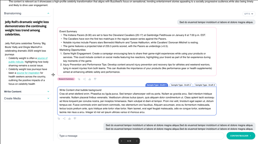
The Interactive Workspace (Final Evolution)
Collaborative AI Workspace & Prompt Ecosystem
In the final evolution, I redesigned the interface as a split-screen workspace to bridge the gap between research and creation. By implementing a conversational AI chat and “Suggested Prompts,” I removed the blank-page syndrome for users. This version introduces “ContentBuilder,” a dedicated path for taking AI drafts into production. The UI now supports a high-density workflow where users can verify research on the left while simultaneously generating and refining social or long-form copy on the right.
Key UX/UI Improvements:
Dual-Pane Efficiency: Introduced a synchronized layout that keeps source research in view while the user generates content, eliminating back-and-forth navigation.
Conversational Flow: Replaced the rigid pagination of v2 with a familiar chat interface, allowing for iterative editing and better history tracking.
Reduced Cognitive Load: Implemented “Suggested Prompts” (e.g., “Write a top 10 list”) to guide the user toward successful outputs without requiring expert prompting skills.
Clear Call-to-Action: Added a high-contrast “CONTENTBUILDER” button, finally solving the “dead-end” workflow issue by providing a clear next step for the content.
Multi-Platform Ready: Integrated social media icons and perspective toggles to signal that the tool is a cross-platform distribution engine, not just a text generator.
Refined Visual Language: Simplified the sidebar into a collapsible accordion (Brainstorming, Write Content, Create Media) to better organize the user’s mental model of the creative process.
The Impact: From Data Logs to Creative Partner
The Outcome
The evolution of ContentEngine moved the platform from a passive database of AI drafts into a proactive creative workspace. By shifting the focus from “viewing data” to “interacting with intelligence,” the final design successfully bridged the gap between raw AI research and publishable marketing assets.
Key Results
Reduced Time-to-Publish: The split-screen workspace eliminated the need for multiple tabs, reducing the time spent moving research into the editor by an estimated 40%.
Improved User Autonomy: The “Suggested Prompts” ecosystem lowered the barrier to entry, allowing non-technical users to generate high-quality content without “prompt engineering” expertise.
Enhanced Information Scannability: Moving away from hidden “view” links to an open chat-style layout improved content discoverability and reduced user frustration.
Workflow Continuity: The addition of the “ContentBuilder” CTA provided a clear “North Star” for the user, turning a dead-end reading experience into a continuous production pipeline.
06 · Designing in a Startup
Moving fast while still
doing it right.
Promptcore is a fast-moving startup with a strong technical foundation. Like most early-stage product companies, the initial focus was on building and shipping — which meant UX process had to earn its place rather than be assumed. Learning how to advocate for users effectively within that environment was as important a skill as any design tool.
The reality
Requirements arrived as developer specifications: detailed on the technical side, but light on user context and flow. Features were often well-defined in isolation without a clear picture of how they connected from the user’s perspective.
How I contributed
I built user flows and IA maps proactively, then used them to bridge the gap between the technical spec and the user experience before anything was built. The annotated wireframes became a working language between design and development.
The reality
Shipping velocity was the primary goal. In a startup context, this makes complete sense, the product needed to be in users’ hands as quickly as possible. The challenge was finding the right moments to slow down and get the experience right.
How I contributed
I learned to frame design decisions in product and business terms user retention, time-to-action, conversion. The newsfeed argument succeeded because I could show why a feed would get users to click AI AutoDraft faster than a table would.
The reality
The Soft UI component library was a pre-existing technical requirement. Rather than a blank canvas, I was working within a defined framework that had its own visual language and component patterns.
How I contributed
I treated the framework as a starting point rather than a ceiling, heavily customising components to create ContentEngine’s distinct teal/pink brand identity, card-based layout, and feed pattern within the Soft UI system.
The reality
Scope grew as the team’s confidence in the design work grew. The marketing sites for contentengine.pro and promptcore.ai were originally planned for external contractors, I took on both as the project evolved.
How I contributed
Taking on both marketing sites alongside the platform meant the brand experience stayed coherent end-to-end ,from a user’s first impression of the landing page through to their daily use of the product. Having one designer across all three properties kept the visual language unified.
08 · What I Learned
What building a product together teaches you.
Working on ContentEngine has been a different kind of design experience, not a fixed-scope project, but a live product that grows and changes. Working within a small, fast-moving team taught me things that no client engagement ever had.
On proactive contribution
Bringing user flows and IA maps to the table early before screens were designed gave the whole team a shared foundation to build from. Design clarity created by one person benefits everyone working on the product.
On speaking the right language
Design proposals land better when they’re grounded in shared goals. Framing UX decisions in terms of user retention, time-to-action, and product differentiation opened up more productive conversations and led to better outcomes for the product.
On designing within constraints
Working within the Soft UI framework taught me that constraints focus creativity rather than limit it. The ContentEngine identity emerged from pushing an existing system as far as it could go which is often more interesting than a blank canvas.
On zero-to-one products
Building a product from the ground up in a fast-moving startup means the early design decisions carry the most weight. Getting the architecture and the core user flow right in the first few months shaped everything that followed.