UX Case Study · B2B Biotech · Website Redesign
The design challenge
that started with
a PowerPoint..
Cardinal Biologicals had been supplying biological samples to medical researchers since 1988. Their website told almost none of that story and before I could redesign anything, I had to convince the CEO it needed redesigning at all. That conversation shaped everything that followed.
My Role
Head of UX/UI Design
Company
Cardinal Biologicals Inc
Type
Full Webstie Redesign
Industry
Biotech · Life Sciences
01 · The Starting Point
Before the design,
the case had to be made
Cardinal Biologicals supplies human and animal biological samples, blood, tissue, organs, fluids, to pharmaceutical companies, biotech firms, and medical researchers across North America. They have been doing this since 1988, with IRB approval and a qualified medical team. It’s a serious, credentialed operation with a 35-year track record.
Their website communicated almost none of this. The existing site was effectively a single page with a vague headline about “biological products.” A Chief Science Officer landing on it had no way to know what was available, how to order it, or whether to trust the company. Potential customers were simply leaving.
● Before

The Cardinal Biologicals website before the redesign. A microscopy image, a logo, and two buttons. No products, no services, no credentials, no reason to stay.”
“Your customers are researchers with a specific need and limited time. If they can’t tell in 10 seconds whether you have what they need, they’ll go to whoever does.”
The argument that started the project
My first task wasn’t to open Figma. It was to sit down with the CEO and make the case that this had to change. I pulled competitor screenshots of companies with clearly structured product catalogues, transparent processes, and visible trust signals. I built a presentation showing what researchers expected to find when they searched for a biological sample supplier, and what they found at Cardinal instead.
Once the CEO was aligned, I had a real brief: design a website that communicates what Cardinal does, what they offer, and why researchers should trust them quickly, clearly, and credibly. The pitch was part of the design process. Not a precondition of it.
02 · Research
Understanding who was ,
actually visiting.
Before restructuring anything, I needed to understand the customer. Cardinal’s buyers aren’t general consumers, they’re scientists and research professionals with highly specific procurement needs, significant budgets, and very little patience for a website that wastes their time.
I developed a primary user persona based on stakeholder interviews and competitor analysis. Alan Robinson, a Chief Science Officer with a background in pharmaceutical and toxicology research captures exactly who Cardinal needed to serve.
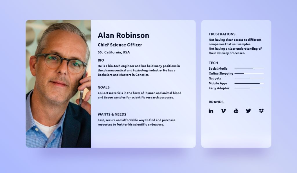
His frustrations are direct: no clear access to companies that sell samples, and no understanding of their delivery processes. These two pain points became the two primary problems the new site had to solve.
If Alan can’t find you, and can’t trust you once he does, the sale doesn’t happen. The redesign had to solve both problems on the homepage.
03 · Information Architecture
Organizing 40+ products
from scratch.
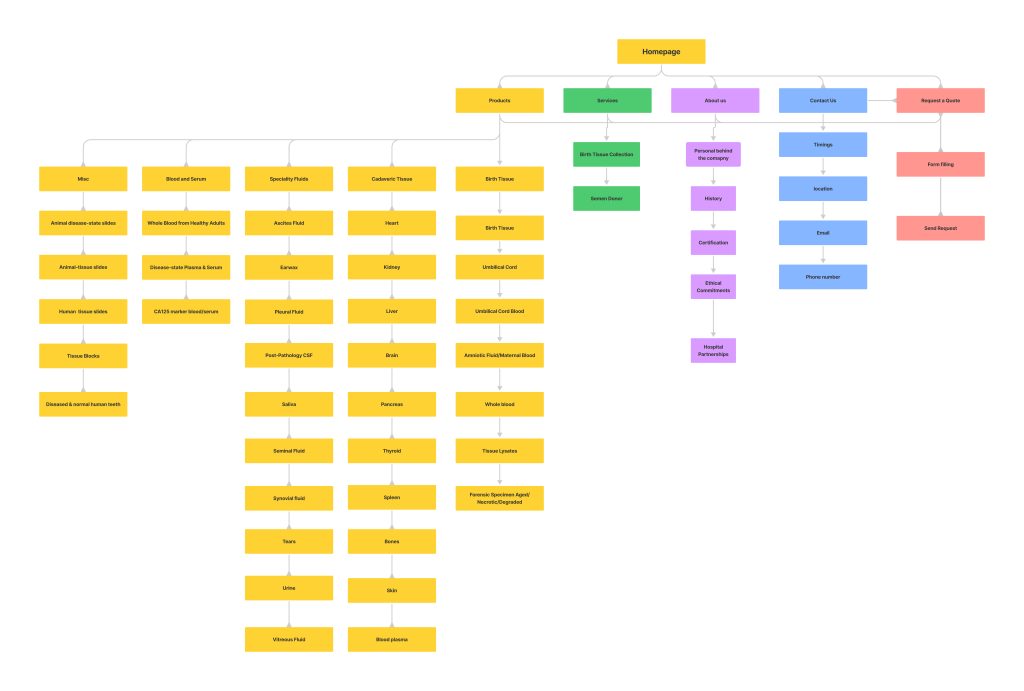
Cardinal’s product catalogue was extensive and completely unstructured online. Before designing a single screen, I mapped every product and service the company offered, from Birth Tissue and Cadaveric Tissue to Speciality Fluids, Blood and Serum, and Miscellaneous items, and organised them into a navigable hierarchy that a researcher could actually use.
The challenge: researchers don’t know Cardinal’s internal terminology. They search by tissue type, application, or species. The architecture had to map to how researchers think, not how the business is organised internally.
40+
Individual product types mapped and categorised
Across 5 major categories, Birth Tissue, Cadaveric Tissue, Speciality Fluids, Blood and Serum, and Misc, each broken into specific sub-products. The site map went through two iterations before the structure was right. The first showed me how deep the catalogue ran. The second refined the top-level navigation so every major customer need had a clear entry point.

Site map — v1
5 top-level sections established
Products · Services · About Us · Contact · Request a Quote — each designed around what a researcher actually needs to do, not how the business is internally organised. This first iteration revealed how much product depth sat beneath the surface.
Product catalogue IA — v2
Full product hierarchy
Every sub-product mapped and categorised. This informed the navigation structure and the product search and filter system.
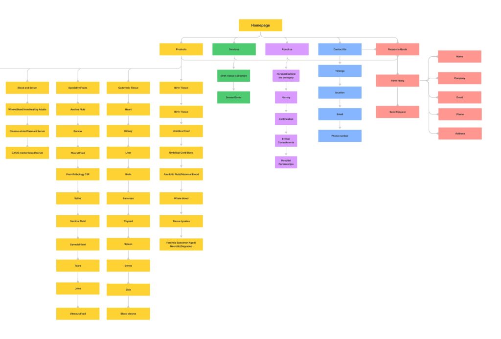
Conversion flow — v2
Request a Quote path
04 · The Core Design Challenge
For this audience, trust isn't a feeling. It's a purchase criterion.
Researchers purchasing biological samples, blood, tissue, organs, from a supplier they’ve never worked with are making a high-stakes professional decision. The samples will be used in studies, submitted in regulatory filings, cited in publications. A supplier who looks untrustworthy online doesn’t get a second chance.
Every design decision in the redesign was therefore a trust decision before it was a visual one. Three elements carried the most weight:
1
Values and ethics front and centre on the homepage
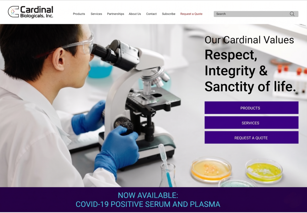
“Respect, Integrity & Sanctity of life” as the hero headline immediately signals to researchers that this is an ethically operated supplier. For scientists sourcing human biological material, this isn’t marketing copy, it’s a procurement requirement. Leading with values rather than products was a deliberate decision to clear the trust threshold before anything else.
2
Process transparency where Alan needed it most
Alan’s second frustration was not understanding delivery and collection processes. The services section was designed to explain exactly how Cardinal collects birth tissue, hospital partnerships, ethical consent processes, post-delivery collection and how its semen donor program operates under FDA-approved facility conditions. This transparency was absent from the old site. It directly addressed the trust gap that was costing Cardinal customers.
3
IRB certification and 35-year track record as the lead credibility statement
The second design iteration sharpened the hero to: “Trusted Partner in supplying Medical Researchers Since 1988” with the Heartland Institutional Review Board seal visible above the fold. This answered both of Alan’s questions in one line, they’ve been doing this for decades, and they’re certified. The phone number and email were also moved to the header so researchers never had to search for contact information.
Final Design
The design decisions behind the redesigned homepage
The redesigned homepage wasn’t just a visual refresh. Every element was a deliberate response to something the research told us about how researchers actually behave when they land on a supplier’s site.
1. A Z-pattern layout built around trust
The hero leads with Cardinal’s core values, Respect, Integrity & Sanctity of life, not a product catalogue. For researchers sourcing human biological material, ethical credibility is the first filter. The layout is structured so the eye moves naturally from the values statement to the CTA block, establishing trust before asking for any action.
2. A sticky announcement banner for time-sensitive information
Critical product availability, like COVID-19 serum, changes frequently and matters immediately to researchers. Rather than burying updates in a news section, a high-contrast banner at the bottom of the hero ensures time-sensitive announcements are visible on arrival without competing with the primary message above.
3. A vertical CTA stack instead of buried links
Products, Services and Request a Quote are grouped as a single vertical stack, creating one clear focal point for next steps. A consistent deep purple across all interactive elements creates a visual language researchers can learn instantly, if it’s purple, it’s actionable.
4. Navigation built for three distinct users
The site serves researchers, procurement officers and strategic partners simultaneously. Rather than building one generic navigation, the seven top-level pillars were chosen to give each user type a direct entry point:
- Researchers navigate through Products and a prominent search bar optimised for SKU-level queries
- Procurement officers are fast-tracked through the high-visibility Request a Quote CTA
- Strategic partners have a dedicated entry point through Partnerships
5. Hero imagery that does design work
The laboratory setting in the hero image isn’t decorative. It places the user in a familiar professional context within milliseconds of the page loading, a visual signal that confirms they’ve found a credible, specialist supplier. Clean typography and generous whitespace reinforce the precision that researchers associate with scientific credibility.
05 · Results
Three numbers that proved the case.
63%
Increase in viewer retention
50%
Increase in site visits
20%
Increase in sales
The 63% retention increase was the most telling number. It meant the redesign solved the core problem: people who found Cardinal were now staying long enough to understand what they offered. The old site was losing them before that understanding could form.
The chain was clear: more visitors staying longer → more of them reaching the Request a Quote form → more quote requests converting into orders. The 50% visit increase confirmed that giving search engines real, structured content to index dramatically improved organic discovery. The 20% sales increase confirmed that a clearer path from “what do you sell” to “I want to buy it” works.
The site went from a single vague page to a structured, credible platform that communicates 35 years of expertise in the first 10 seconds. That’s what the redesign was always for.
06 · What I Learned
Design is only half the job.
This project taught me something I’ve carried into every engagement since. The most important design work sometimes happens before you open a design tool.
On stakeholder buy-in
Convincing the CEO wasn’t a detour, it was the project. Without that alignment the redesign wouldn’t have happened. I’ve learned to treat the pitch as part of the design process, not a precondition of it. The skills that get a brief approved are design skills too.
On IA for specialist audiences
40+ products sounds manageable until you try to organise them for a user who doesn’t know your internal terminology. The IA work was the hardest part of this project — and the part that made everything else possible. Getting the structure right before touching screens saved weeks of redesign later.
On trust as a design problem
For researchers purchasing biological samples, trust is the primary purchase criterion — not price, not speed. Every design decision — team page, ethical commitments, IRB certification, process transparency — was a trust decision before it was a visual one.
On iteration after launch
The first version wasn’t the final version. The retention data told me where the second iteration needed to go. Shipping fast and learning from real users got us to a better product than any amount of pre-launch refinement would have.