UX Case Study · Enterprise B2B · 2022–2024
The system 1,300+ healthcare organisations depended on was designed for no one.
HealthPro Canada manages pharmaceutical procurement for hospitals and clinics across every Canadian province and territory. Their member portal was the operational backbone, and it was completely broken. I was brought in to redesign it.
My Role
Head of UX/UI Design
Stakeholders
HealthPro · E&Y · Datainvent
Timeline
3 months to Prototype
Status
Live
A note on scope:
This project touched over a 100 different identified pain points across 20 different user journeys. For this case study, I'm focusing on two: the product refund claim flow, and claim status visibility after submission. These two changes had the most measurable impact and tell the clearest design story.
01 · The Situation
A system that punished
its own users.
HealthPro Canada coordinates pharmaceutical procurement for over 1,300 member organisations,hospitals, clinics, and pharma companies spanning every Canadian provinces and territories. Their member portal was where this all happened: contract management, product sourcing, refund claims, drug shortage tracking, issue reporting.
When I joined, the portal looked and behaved like it was built in the early 2000s. Because it was. There were no breadcrumbs, no inline calculations, no status feedback, and no visual hierarchy. Members were expected to use this system daily for critical healthcare supply operations, and they needed days of training just to navigate it.
20+
Hours of research before anything was designed
I spent the first two weeks embedded in three departments, not sketching, not wireframing. Just listening. Structured requirements sessions with HealthPro’s COO, subject matter experts, and Ernst & Young’s project managers. What emerged wasn’t a list of features. It was a picture of people who had spent years adapting themselves to a system that should have been adapting to them.
Nine distinct pain points emerged from that research. Three of them were in the refund and claims flow alone: no navigation context, no inline calculation, and no status visibility after submission. That’s three separate ways the system made a routine task feel like navigating a maze, every single time.
“Members required extensive training to navigate the portal. We needed to design something so intuitive, the training becomes unnecessary.”
Before touching a single wireframe, I mapped the current-state user journey for every major flow, plotting every step, every friction point, every unanswered question. This gave the entire team, HealthPro, E&Y, and Datainvent, a shared foundation to build from.
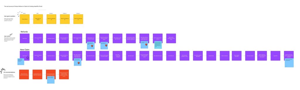
Product Refund & Claims — existing journey
Mapping every step, pain point, and open question in the refund flow, before any redesign work began.
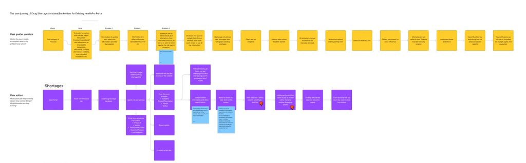
Drug Shortage & Backorders — existing journey
Tracking how members currently navigated shortage information, and where the system failed them.
01 · The Process
Research first. Then move fast.
Given the complexity — three organisations, multiple C-suite stakeholders, 1,300+ end users across Canada — I front-loaded research heavily. Only once I had a clear picture of the problem space did I start designing. And then I moved quickly.
How I worked through this project
01
Deep discovery
20+ hours across three departments. User stories and personas grounded in observed behaviour, not assumption.
02
Journey mapping
03
Wireframing
Lo-fi wireframes in Balsamiq covering eight core screens — reviewed and annotated with stakeholders.
04
Hi-fi + handoff
Full design system, interactive prototype, and developer handoff — all within three months of project start.
03 · Problem One
Filing a refund claim took three steps, three screens, and
zero context.
The most common task in the portal filing a product refund claim required members to navigate a 3-step wizard. At every step, context disappeared. Members had no idea where they were in the process, what information they’d need before starting, or how to go back without losing their work.
To make it worse: the form assumed members had their HealthPRO Item number memorised. Most didn’t. And the refund calculation, the whole point of the claim, had to be done manually on paper or in Excel, then re-entered. The system was forcing members to do its job for it.
● Before — Legacy portal
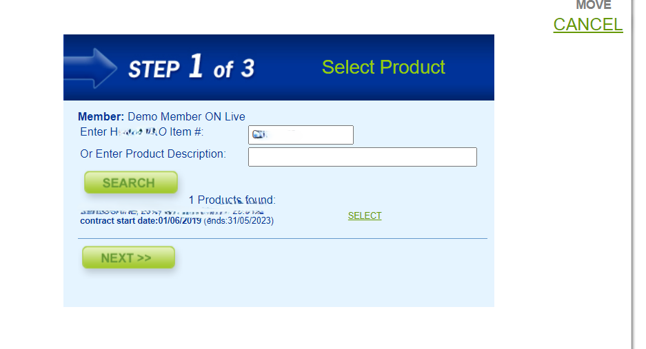
Step 1 of 3. “Enter HealthPRO Item #” ; a field that assumed members had the number to hand. No search by product name. No context about what comes next. No way to know what information they’d need.
● Before — Legacy portal
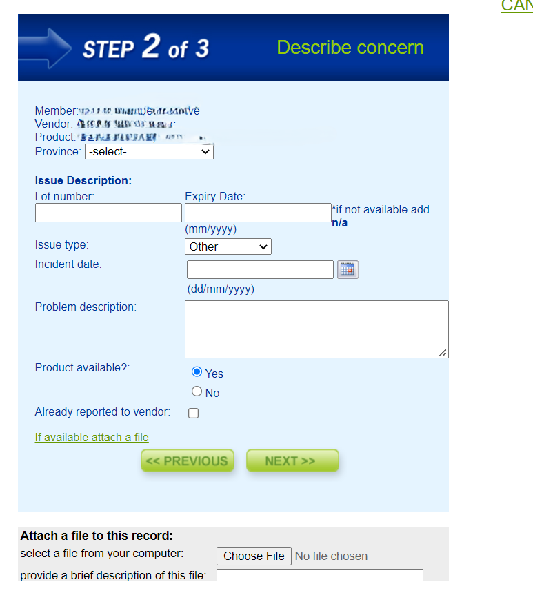
Step 2 of 3. Date format instructions in parentheses, a scrolling file attachment field, dropdowns with placeholder text. Every interaction required the user to know the system’s rules. The refund calculation happened nowhere on this page, members had to do it themselves.
● After — Product Refunds Single Page
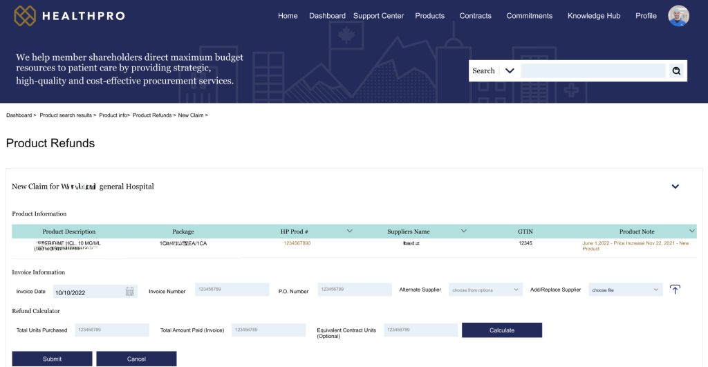
One page. Everything visible. The 3-step wizard is gone. Product information, invoice information, and the refund calculator all appear on a single page — members can see and verify every detail before submitting. The breadcrumb trail (Dashboard › Product search results › Product info › Product Refunds › New Claim) gives orientation at every moment. The navigation bar means they can jump anywhere without losing their place.
● After — Inline Refund Calculator Showing Differential Calculation
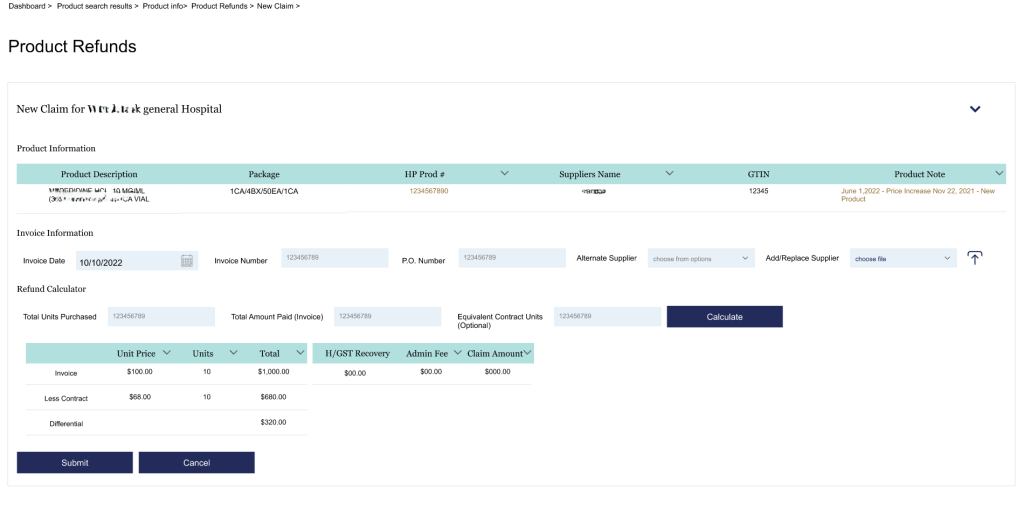
The refund calculator, built in. Previously, members manually calculated the differential between their invoice price and the contract price, then entered the result. Now the system does it, Invoice, Less Contract, and Differential appear automatically after clicking Calculate. One less manual step, and one less source of error on every claim submitted.
04 · Problem Two
Submit a claim. Hear nothing. Have no idea what happened next.
After a member submitted a refund claim in the old system, they landed on a nearly empty page. A few plain-text links to PDF reports. No status. No history. No confirmation that anything had been received.
Members had to call HealthPro staff to find out if their claim existed. For a portal serving hospitals and pharmaceutical companies managing budgets in the millions, this was an operational gap,not just a UX problem.
● Before — Legacy portal
No items found. After submission, members reached a page that showed nothing or a handful of links to PDF reports that required downloading and manually scanning. No Claim IDs. No status. No way to know if the submission had been received at all.
● After — Redesigned Portal
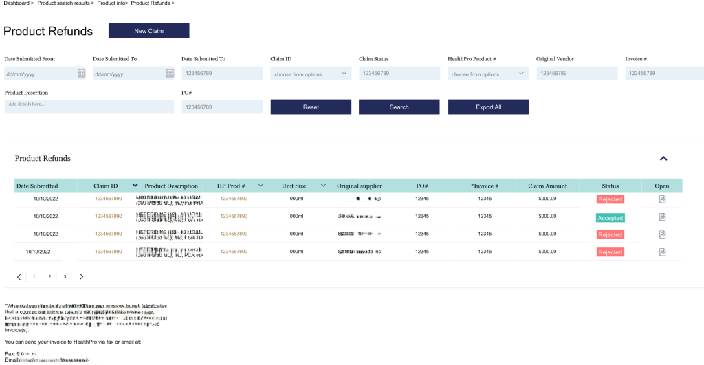
Full visibility, always. Every submitted claim appears in a sortable table with a clear Accepted or Rejected status badge, a Claim ID, the submission date, the product, the claim amount, and a PDF link for documentation. Eight filter fields let members find any claim instantly. Members no longer need to contact HealthPro staff to check on a claim — the information is simply there.
05 · Why It Worked
Five decisions. One principle.
Every design decision in the redesign came back to the same research-derived principle: members shouldn’t have to know how the system works. The system should work the way members think.
01
Collapsed the 3-step wizard into a single page
The old flow forced context to disappear at every step, members couldn’t verify earlier inputs once they’d moved forward. Consolidating everything onto one page meant all information was visible and verifiable before submitting. No back-tracking, no lost context, no starting over.
02
Built the refund calculator directly into the form
Members were manually calculating invoice-to-contract differentials on paper and re-entering them. Error-prone, time-consuming, and entirely avoidable. Moving the calculation inline, Invoice, Less Contract, Differential shown automatically, eliminated a manual step from every single claim submission.
03
Added persistent navigation and breadcrumbs to every page
One of the most frequently cited pain points was members not knowing where they were in the portal. A persistent top navigation bar and breadcrumb trail on every page, a simple change that had an outsized effect on orientation and confidence. Members could explore freely without fear of getting lost.
04
Made claim status immediately visible after submission
The old system gave members no signal that anything had happened after they submitted. The new claims list surfaces every submission with a clear status badge, a Claim ID, amounts, and documentation access. The information members were calling staff to ask for is now visible the moment they log in.
05
Built a design system, not just screens
The portal spans dozens of views and would continue to evolve after launch. Rather than designing isolated screens, I built a full component library aligned to HealthPro’s brand, so the development team could build consistently and future iterations wouldn’t require starting from scratch each time.
06 · Outcome
From a system
people endured to one
they can actually use.
3 Months
Research to working prototype in stakeholder hands
1300 +
Member organizations across every Canadian province and territory
∞
Sprint cycles post-launch — still iterated and maintained today
The portal went from a system that required days of training to one members could navigate without instruction. With every sprint cycle, a new friction point was resolved.
The feedback from the client shifted from “how do we fix this?” to “what can we add next?” — which is the clearest signal that the foundation is working.
The portal is live today, in active use across all Canadian territories, serving hospitals, clinics, and pharmaceutical companies that depend on it for the operational work of national healthcare supply.
07 · What I Learned
What designing for
people who
can't afford mistakes
teaches you.
Working on ContentEngine has been a different kind of design experience — not a fixed-scope project, but a live product that grows and changes. Working within a small, fast-moving team taught me things that no client engagement ever had.
ON ENTERPRISE STAKEHOLDER MANAGEMENT
Managing stakeholders across three organisations — a client, a consulting firm, and a technology partner — taught me that alignment is a design deliverable. Getting HealthPro, Ernst & Young, and Datainvent to agree on a direction before a single screen was built was as important as the screens themselves. The annotated wireframes weren’t just documentation. They were a negotiation tool.
ON RESEARCH AS PROTECTION
Spending two weeks doing nothing but research felt like a risk in a fast-moving project. It turned out to be the opposite. Every design decision that got challenged in review — and there were many — had a direct answer rooted in something a real member had said or done. Research doesn’t slow you down. It protects every decision you make.
ON DESIGNING FOR HIGH STAKES USERS
Healthcare procurement staff aren’t casual users. They’re busy, under pressure, and accountable for decisions that affect patient care. Designing for them meant that every interaction had to be correct first, elegant second. Clarity is never a nice-to-have when the people using your product can’t afford to make mistakes.
ON BUILDING SYSTEMS, NOT SCREENS
Early in my career I designed screens. On this project I learned to design systems. The component library I built wasn’t the visible output — but it’s what made every screen consistent, every future sprint faster, and every developer handoff cleaner. The work nobody sees is often the work that matters most.