Crafting a Vibrant Online Hub: Designing a Website for Milton’s Creative Haven
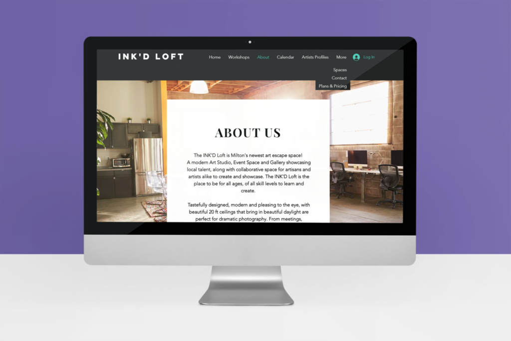
Embarking on a journey of digital creativity, I undertook the task of designing a website for a local creative hub nestled in the heart of Milton, Ontario. This endeavor seeks to capture the essence of the space while weaving together its multifaceted objectives to serve as a vibrant and inclusive community resource.
Visualizing the Vision: A Digital Abode of Creativity
The website’s core mission is to be a visual representation of the creative haven it embodies. By harmoniously blending aesthetics and purpose, I endeavored to create an immersive online experience that beckons visitors to explore its offerings and engage with its spirit.
Seamless Navigation, Abundant Information: A Window into the Possibilities
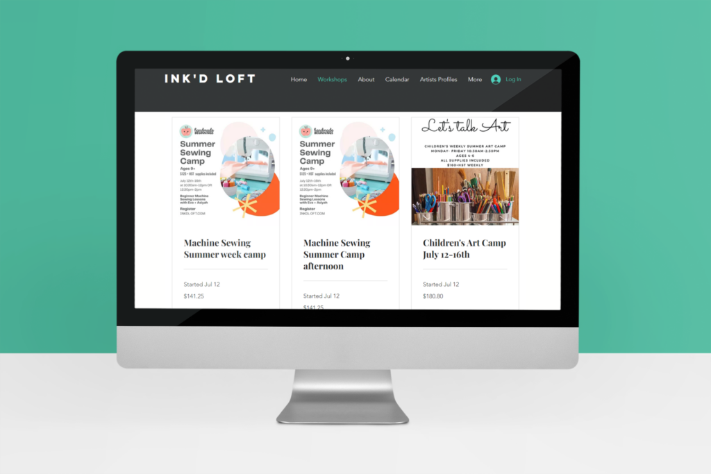
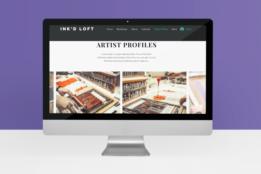
Recognizing the diverse array of objectives the creative hub seeks to fulfill, the website was meticulously crafted to be a treasure trove of information. Clear and intuitive navigation acts as a compass, guiding visitors through the various facets of the hub’s offerings: products, rental party spaces, artist studios, and captivating workshops for children.

Empowering Diverse Audiences: A Space for All
The website has been thoughtfully designed to cater to different audiences with unique needs. Whether it’s event organizers seeking the perfect venue, artists craving a haven for their creative pursuits, or parents in search of enriching workshops for their children, the website seamlessly tailors its content to resonate with each demographic.
Empathetic User Journeys: Pioneering Intuitive Exploration
Every click, every scroll, and every interaction is a part of the user’s journey through the website. By orchestrating user flows with precision and empathy, I aimed to ensure that visitors effortlessly unearth the information they seek. From showcasing the features of rental party spaces to providing insights into artist studio amenities, the website offers a dynamic expedition of discovery.
Elevating Engagement: From Information to Interaction
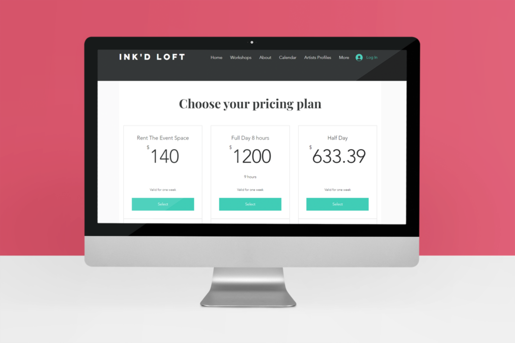
Beyond being a repository of knowledge, the website is a gateway to engagement. Through strategic design, I integrated interactive elements that entice users to not only consume information but to take actionable steps. This ranges from streamlined booking processes for event spaces and workshops to seamless product purchases that transform intention into action.
An Intersection of Design and Functionality: The Digital Marketplace
One of the highlights of the website is its dual role as an informative platform and a digital marketplace. Users are seamlessly guided from browsing to booking, transforming their digital exploration into tangible experiences. The website’s interface seamlessly integrates with backend systems, creating a frictionless experience that empowers users to make purchases and bookings with ease.
In the vibrant tapestry of Milton’s creative hub, the website stands as a digital masterpiece, embodying the space’s objectives, aspirations, and offerings. By harmonizing aesthetics with functionality, weaving together diverse user journeys, and pioneering a seamless digital marketplace, the website serves as a testament to the boundless possibilities of design. It captures the soul of the creative haven, inviting visitors to embark on a digital expedition that not only informs but inspires, connecting community members and fostering a shared love for creativity and artistry.
As the design process unfolds, these personas act as constant companions, steering the website’s architecture, aesthetics, and functionality. By placing the user at the center of the design, the website transforms into an intuitive digital haven that effortlessly caters to Sana, Jane, and countless others. From clear navigation paths to immersive visuals, seamless bookings to captivating workshops, the personas serve as the driving force behind creating an online space that reflects the essence of Milton’s Creative Haven.
In crafting these personas, I’ve woven the threads of user insights into the very fabric of the design, ensuring that Milton’s Creative Haven is not just a physical space but an immersive digital experience that resonates with the dreams and aspirations of its vibrant community.
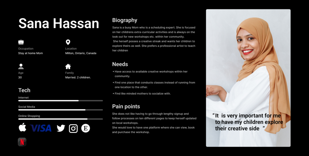
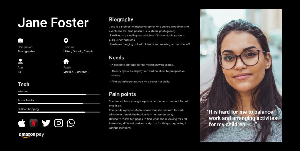
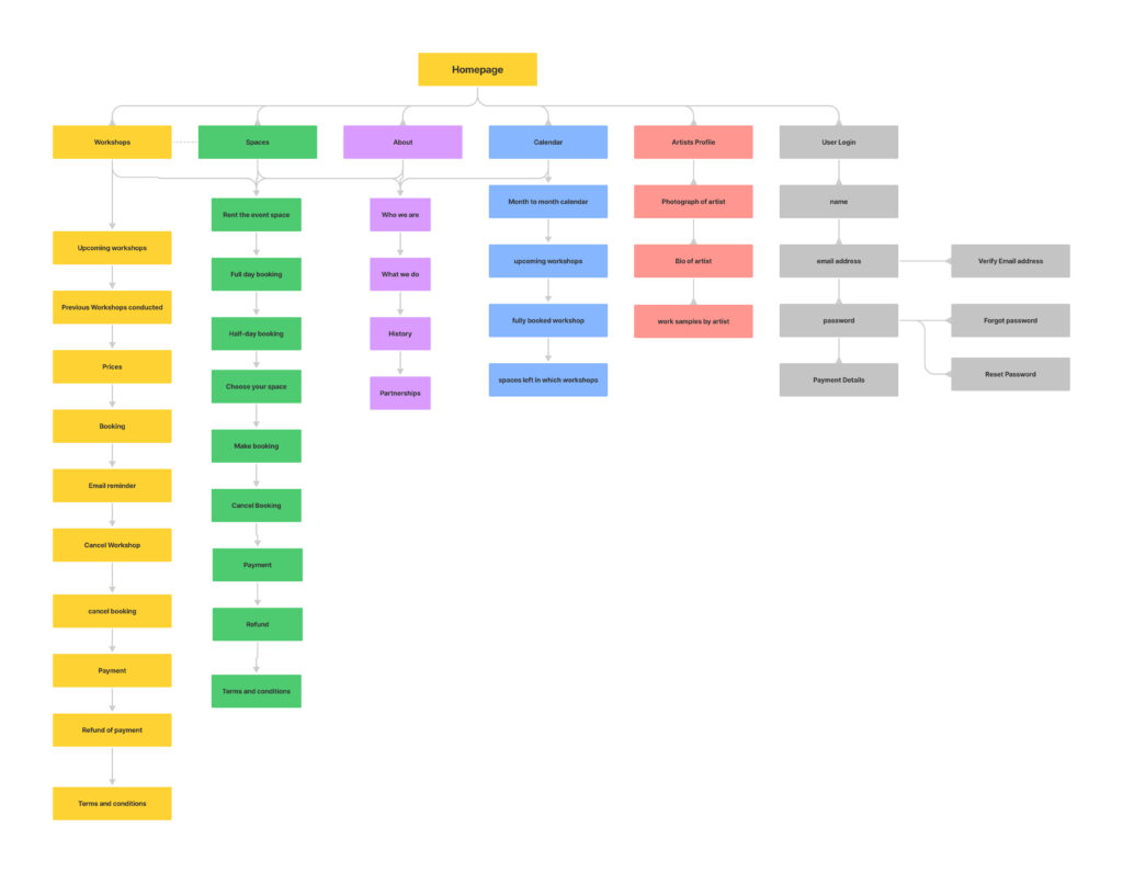
Embarking on the journey of crafting a cohesive and user-friendly digital experience, I recognized the paramount importance of structuring information in a meaningful and intuitive manner. To achieve this, I employed a meticulous process of categorization that formed the cornerstone of an intricate data map.
1. Segmentation Strategy: Carving Navigational Pathways
Every corner of the website was methodically divided into distinct categories, each serving as a thematic hub for specific content. This strategic segmentation was driven by a profound understanding of user needs and preferences, ensuring that information would be effortlessly discoverable.
2. Thematic Containers: Housing Coherent Information
Each category emerged as a thematic container, accommodating a collection of interrelated data points. This arrangement was a conscious effort to streamline user interactions and offer a seamless path to relevant content. By grouping similar elements, I created a logical and efficient structure that mimicked users’ thought processes.
3. Navigational Compass: Guiding User Exploration
These categories played a pivotal role in shaping the website’s navigation. Acting as a navigational compass, they provided users with clear signposts to guide their exploration. Users could now embark on their digital journey with confidence, knowing they were traversing pathways carefully aligned with their goals and interests.
4. Coherent Retrieval: Streamlining Information Access
The impact of this categorization strategy extended beyond navigation; it also revolutionized information retrieval. Users no longer needed to embark on a quest to find relevant data. Instead, the logical organization ensured that relevant content was within easy reach, fostering a seamless interaction between users and the digital realm.
5. Enhanced Engagement: Empowering User Exploration
The meticulous categorization amplified user engagement by catering to diverse interests and requirements. Each category offered a curated experience, catering to specific needs, whether it was event seekers, artists in search of studio spaces, or parents looking for creative workshops. This tailored approach forged a strong connection between users and the website.
6. Clarity and Structure: Forging User-Centricity
In essence, the strategic categorization breathed life into the data map, infusing it with user-centricity. By mirroring users’ mental models and presenting information in a manner that resonated with their expectations, I crafted an environment where every interaction felt purposeful and aligned.
The result was a data map that transcended mere organization. It became an embodiment of user empowerment, ensuring that each interaction with the website was a journey of discovery, clarity, and fulfilment. Through strategic categorization, I transformed data into a narrative, elevating the website into a conduit of meaningful experiences for all who navigated its pathways.
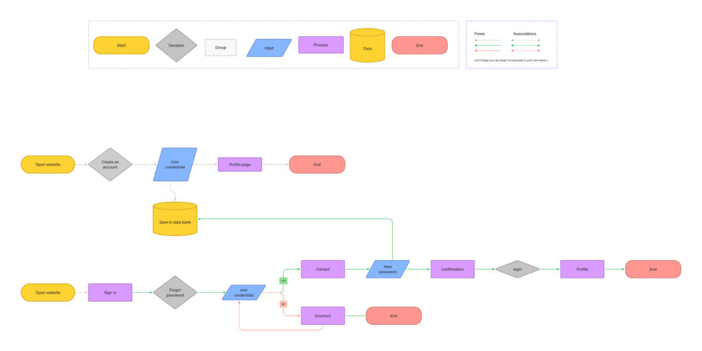
With the solid foundation of information architecture in place, my focus shifted to shaping the user experience into a seamless and intuitive journey. To achieve this, I harnessed the power of Figma to craft intricate user flows that elegantly guided users through the digital landscape, ensuring meaningful interactions and connections.
1. Strategic Sequencing: Orchestrating Purposeful Pathways
User flows acted as choreographed sequences, seamlessly guiding users from point to point. Each step was strategically designed to align with their goals and expectations, ensuring that the journey felt intuitive and purposeful.
2. Intuitive Navigation: Enhancing User Understanding
Through visual representations, I outlined the logical sequence of actions, allowing users to anticipate the outcomes of their interactions. This intuitive navigation eliminated confusion and empowered users to traverse the website with confidence.
3. Interaction Blueprint: Designing Cohesive Connections
Every user flow represented a blueprint for interactions, ensuring that each click, swipe, or tap seamlessly transitioned users from one point to another. This cohesiveness was meticulously crafted to reduce friction and enhance the overall experience.
4. Task Completion: Streamlining Goal Achievement
The user flows were a roadmap to task completion. They illuminated the most efficient routes to achieving objectives, offering users clear directions on how to navigate from their starting point to their desired destination.
5. User-Centric Alignment: Meeting User Expectations
User flows were not only about navigation; they were also about aligning with user expectations. By mapping out user journeys, I anticipated users’ needs and catered to their preferences, ensuring that each interaction mirrored their mental models.
6. Iterative Refinement: Continual Enhancement
User flows were a dynamic tool, constantly evolving based on user feedback and testing. I refined and adjusted the flows as insights were gathered, ensuring that the experience consistently aligned with user behavior and preferences.
7. Collaborative Insights: Facilitating Stakeholder Understanding
The visual nature of Figma allowed for easy sharing and collaboration, ensuring that stakeholders could actively participate in shaping the user flows. Their input enriched the flows, resulting in journeys that resonated with both users and business objectives.
In essence, the creation of user flows in Figma was the art of transforming information architecture into meaningful experiences. It was a meticulous process of aligning design with user needs, expectations, and objectives, resulting in a digital landscape where every interaction was purposeful and engaging. Through Figma, I harnessed the power of visualization to craft pathways that led users to their destination with clarity, confidence, and satisfaction.

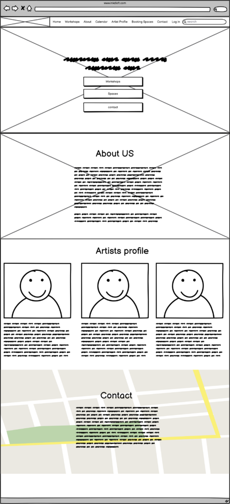
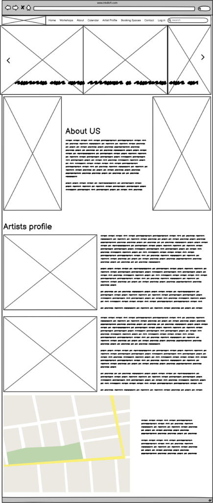
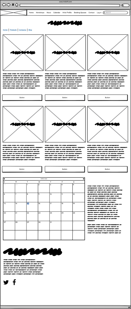
With a comprehensive arsenal of data points and a meticulously crafted information architecture at my disposal, I embarked on the pivotal stage of translating ideas into tangible design concepts. Balsamiq became my creative canvas, where I wielded its tools to fashion wireframes that encapsulated the essence of user interactions and interface components.
1. Structural Visualization: Blueprinting the Skeleton
Balsamiq empowered me to transform abstract concepts into visual structures. I orchestrated the arrangement of elements, delineating the layout’s skeletal framework. This provided stakeholders with a tangible representation of the interface’s organization and hierarchy.
2. Simplicity and Focus: Stripping Down to Essentials
The essence of wireframing lay in simplicity. I strategically omitted intricate details, focusing solely on core components. By paring down the design to its essentials, I channeled the user’s attention towards the core functionalities and navigational pathways.
3. Navigational Pathways: Crafting Intuitive Flows
Through wireframes, I meticulously outlined the journey users would undertake. Navigational pathways were etched out, guiding users seamlessly from one point to another. This visual narrative elucidated the intuitive interactions users would engage in, fostering a sense of familiarity and ease.
4. Content Placement: Strategic Information Distribution
Wireframes facilitated the deliberate positioning of content elements. I placed text, images, buttons, and other interface components with precision, ensuring each played a strategic role in enhancing usability and engagement.
5. Iterative Exploration: Pioneering Design Possibilities
Balsamiq’s iterative nature allowed me to explore design iterations swiftly. I fine-tuned layouts, evaluated alternatives, and iterated based on stakeholder feedback. This flexibility enabled me to refine wireframes iteratively, aligning them more closely with user needs.
6. Stakeholder Collaboration: Bridging Vision and Execution
Wireframes were an invaluable tool for stakeholder collaboration. Through Balsamiq, I facilitated discussions that bridged the gap between vision and execution. Stakeholders gained a tangible glimpse of the design’s direction, fostering productive dialogues and informed decision-making.
7. User-Centric Validation: Testing and Refinement
Wireframes became a conduit for user-centric validation. I conducted user testing and gathered feedback on wireframes, ensuring that user expectations and needs were met. Insights gleaned from these tests informed refinements, steering the design towards enhanced user satisfaction.
In essence, wireframing with Balsamiq was the craft of translating intricate planning into a tangible visual blueprint. It was the art of orchestrating simplicity, focus, and navigational clarity to shape a user-centric interface. By wielding Balsamiq, I manifested the marriage of functionality and aesthetics, laying the groundwork for a digital realm that resonated with users’ needs and aspirations.
