In-depth User Research: Conducted comprehensive user research to understand user needs and pain points, informing the foundation of the redesign strategy.
Holistic UI/UX Evaluation: Identified and addressed deficiencies in both user interface (UI) and user experience (UX) elements, enhancing overall usability for users and business alike.
Strategic Design Proposal: Formulated a well-crafted design and marketing proposal that synthesized research insights, presenting a compelling vision for the website’s transformation.
Shift to E-commerce Focus: Transformed the website from a knowledge-centric hub to an efficient e-commerce platform, optimizing user engagement and supporting the company’s objectives.
Robust Design Framework: Conceptualized and executed a comprehensive design framework, encompassing information architecture, mockups, user personas, user stories, wireframes, and a functional prototype, culminating in the final implementation on the WordPress platform.
Cross-functional Coordination: Collaborated seamlessly with diverse teams to gain nuanced insights into the company’s operations, ensuring alignment between design solutions and core business processes.
Strategic Social Media Enhancement: Developed a targeted social media strategy and captivating ad designs, carving out a distinct online niche for Cardinal Biologicals, Inc. This strategic approach led to a noteworthy upsurge in sales figures.
My contributions to the Cardinal Biologicals, Inc. website redesign project stand as a testament to my ability to fuse creativity with strategic insights, resulting in a dynamic online presence that not only caters to user needs but also catalyzes business growth.


In a methodical review of the existing website’s design and user flow, I conducted an in-depth analysis to pinpoint significant design gaps. The assessment revealed the following key areas of concern:
Unambiguous Representation: The landing page lacked clarity in communicating the core focus of the business, particularly considering the specialized nature of the client’s medical products and specimens.
Enhancing Homepage Relevance: The information presented on the homepage exhibited redundancy and lacked actionable elements for the end-user. This deficiency hindered the effective communication of the company’s primary offerings.
Optimizing Product Presentation: Given the distinctive and niche character of the client’s products, the categorization and description of the product offering required refinement. The absence of a structured product hierarchy impeded the user’s ability to explore and select specific items.
Streamlining Information Accessibility: The information hierarchy suffered from inefficiencies, necessitating multiple clicks to access desired product details. This complexity hindered the seamless user experience.
Elevating Visual Elements: Graphics featured across the website were not aligned with current best practices in optimization, resulting in suboptimal visual representation.
Redefined Purpose for the Blog: The blog section lacked a clear purpose and failed to contribute to the overall user experience and engagement.
By meticulously identifying these areas of concern, I laid the foundation for a strategic redesign approach that aimed to address each challenge comprehensively. Through iterative design iterations and collaborative discussions with stakeholders, my goal was to transform these shortcomings into strengths, ultimately enhancing the website’s usability, visual appeal, and overall user engagement.
In the meticulous process of crafting this website, a versatile array of tools was harnessed, each contributing its unique prowess to various stages of development:
Excel Sheets: Employed for precise data gathering and in-depth research, facilitating a comprehensive understanding of project prerequisites.
Balsamiq: Skillfully wielded to draft wireframes, enabling a tangible visualization of website layout and structural components.
Figma: Skillfully employed for the design and prototyping phase, seamlessly transforming wireframes into interactive and visually captivating interfaces.
WordPress: Powering the development phase, WordPress served as the robust foundation for creating the functional website.
Elementor: Leveraged as a dynamic WordPress plugin, Elementor emerged as an instrumental tool for infusing design enhancements into the website.
MailChimp Integration: Seamlessly integrated into the framework, MailChimp’s capabilities facilitated efficient communication and engagement strategies.
This multifaceted toolset harmoniously converged, amplifying the project’s capabilities at each stage, from conceptualization and design to development and integration. Through their collaborative synergy, a dynamic and engaging website emerged, poised to leave a lasting impression on users.

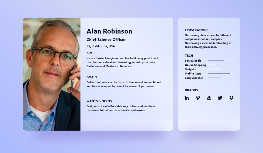
The process of persona development unfolded as a natural extension of an exhaustive user research endeavor. Meticulously guided by insights garnered from comprehensive user interactions, the creation of personas served as a pivotal step in shaping the user-centric design approach.
User research unveiled the distinct motivations, preferences, and pain points of the diverse audience interacting with the website. These invaluable insights paved the way for crafting detailed personas, encapsulating the essence of various user archetypes. Each persona is a composite representation, meticulously constructed to embody the behaviors, goals, and aspirations of distinct user segments.
This human-centered approach empowers the design process by enabling a holistic understanding of user needs and expectations. Personas serve as constant companions throughout the design journey, influencing decision-making, driving empathy, and ensuring that the final product resonates authentically with the intended user base.
By weaving the narrative of these personas into the design fabric, the resulting website stands as a testament to the harmonious interplay between user insights and creative ingenuity – a digital realm thoughtfully tailored to cater to the distinct needs of its diverse audience.
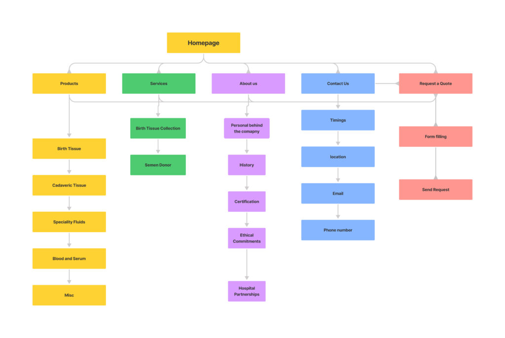
Website Categorized for Comprehensive Data Mapping:
To ensure a systematic and organized representation of the extensive content, the website was meticulously segmented into distinct categories. This strategic breakdown of the website’s structure facilitated the creation of a comprehensive data map, orchestrating the intricate interplay of diverse information points.
Each category served as a thematic container, housing a cohesive collection of related data elements. This segmentation not only enhanced the navigational clarity for users but also streamlined the process of information retrieval. By aligning content under relevant categories, the data map became a navigational compass, guiding users through a coherent and intuitive browsing experience.
The categories acted as strategic waypoints, guiding the placement of content, ensuring seamless access to essential information, and optimizing user engagement. This methodical organization, anchored in the user’s perspective, imbued the website with a sense of clarity and purpose, elevating it into a user-centric digital haven where information effortlessly flows and resonates with its audience.
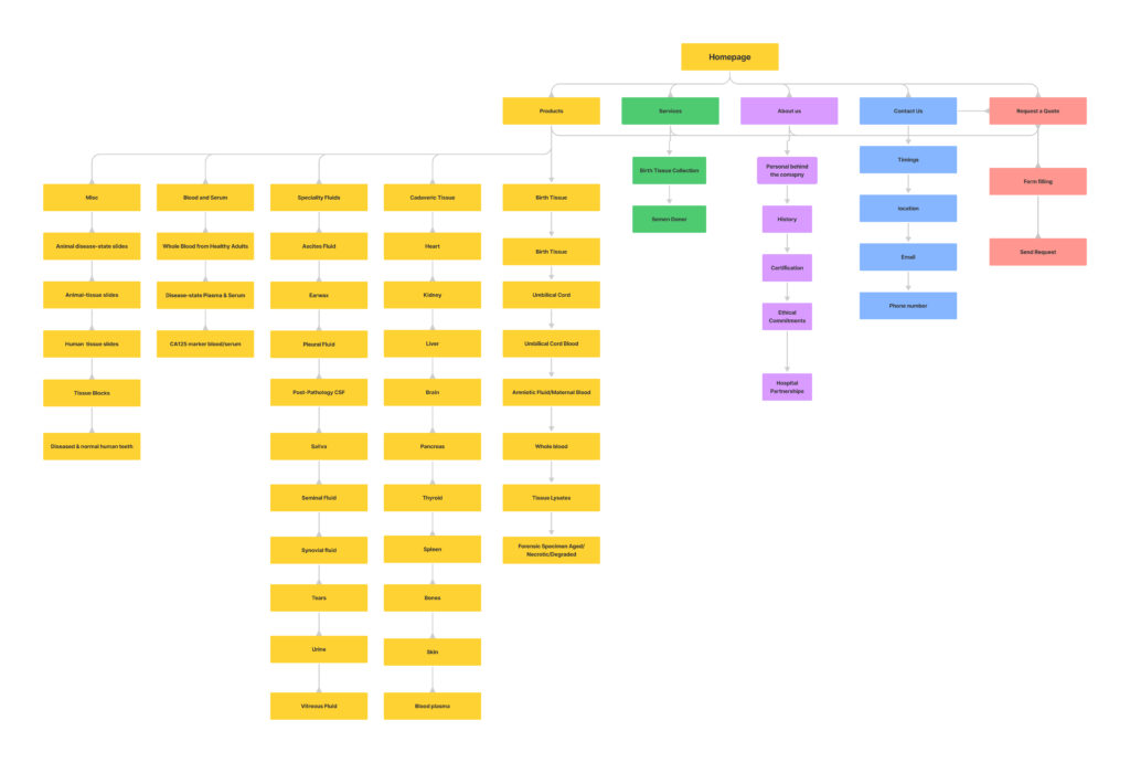
Refining Data Points for an Elaborate Website Map:
Having established a preliminary organizational framework through the categorization of the website, the journey continued with a deeper level of granularity. This involved a meticulous process of dissecting and refining data points to fashion a more intricate and detailed map of the website’s landscape.
The intricate web of content was methodically deconstructed, scrutinized, and rearranged to unveil a comprehensive portrayal of information relationships. By delving into the nuances of each category, subcategories and subtopics were delineated, each contributing to the rich tapestry of the website’s architecture.
This meticulous breakdown served a dual purpose: it not only facilitated a clearer understanding of content interconnections but also honed the user experience to a fine-tuned level of sophistication. The refined map emerged as an invaluable tool, guiding content placement, navigation design, and overall user interaction.
The result is a dynamic web of information, woven with meticulous care, and designed to empower users with a seamless journey through the depths of knowledge. This intricate website map stands as a testament to the harmonious fusion of thoughtful organization and user-centric design, promising an enriching and intuitive exploration for every visitor.
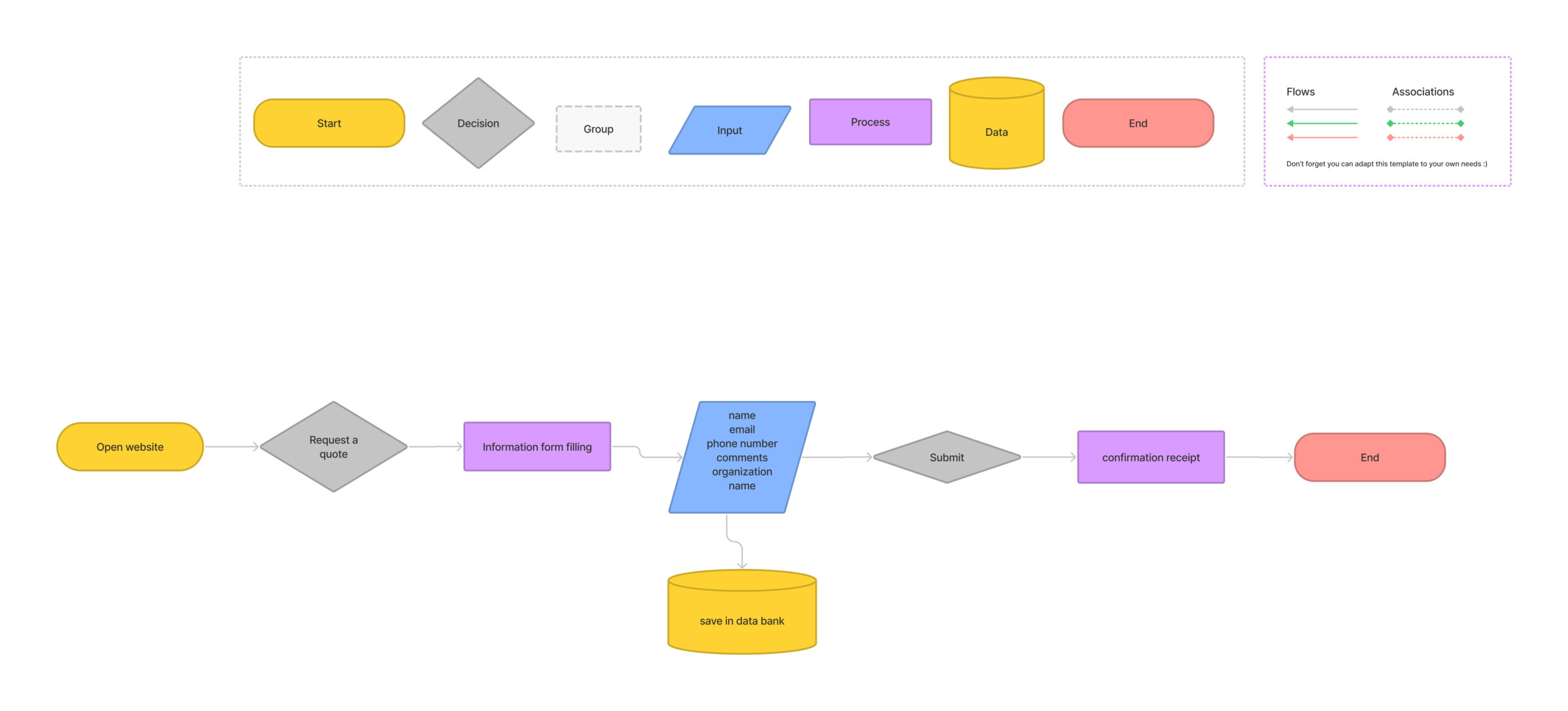
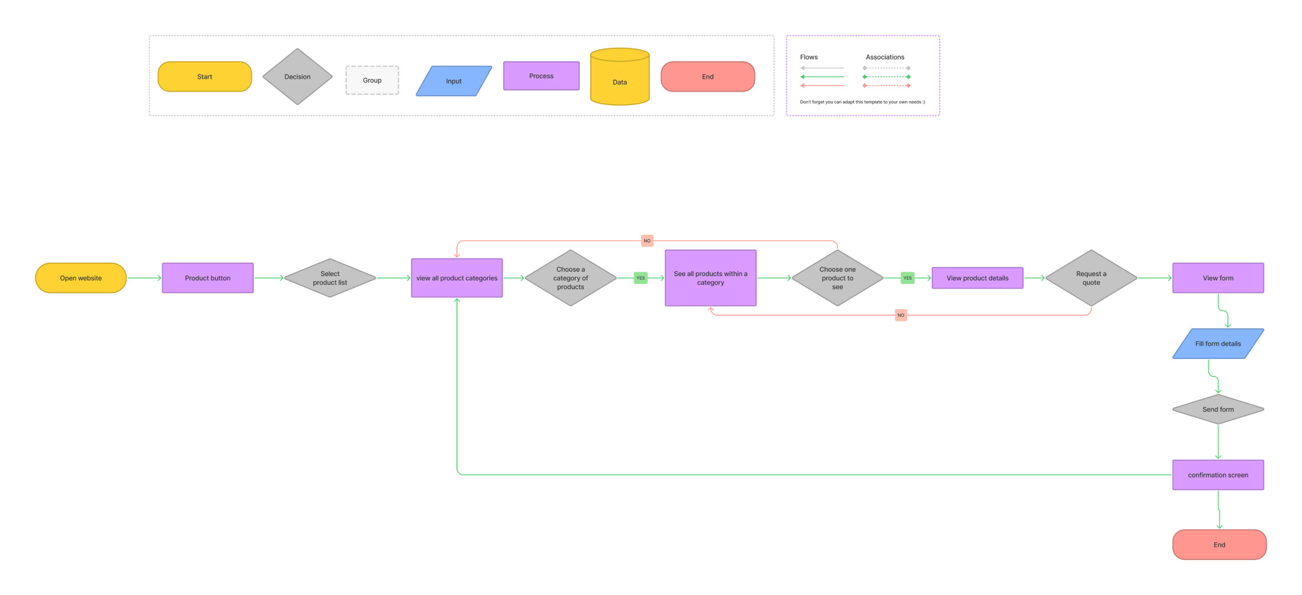
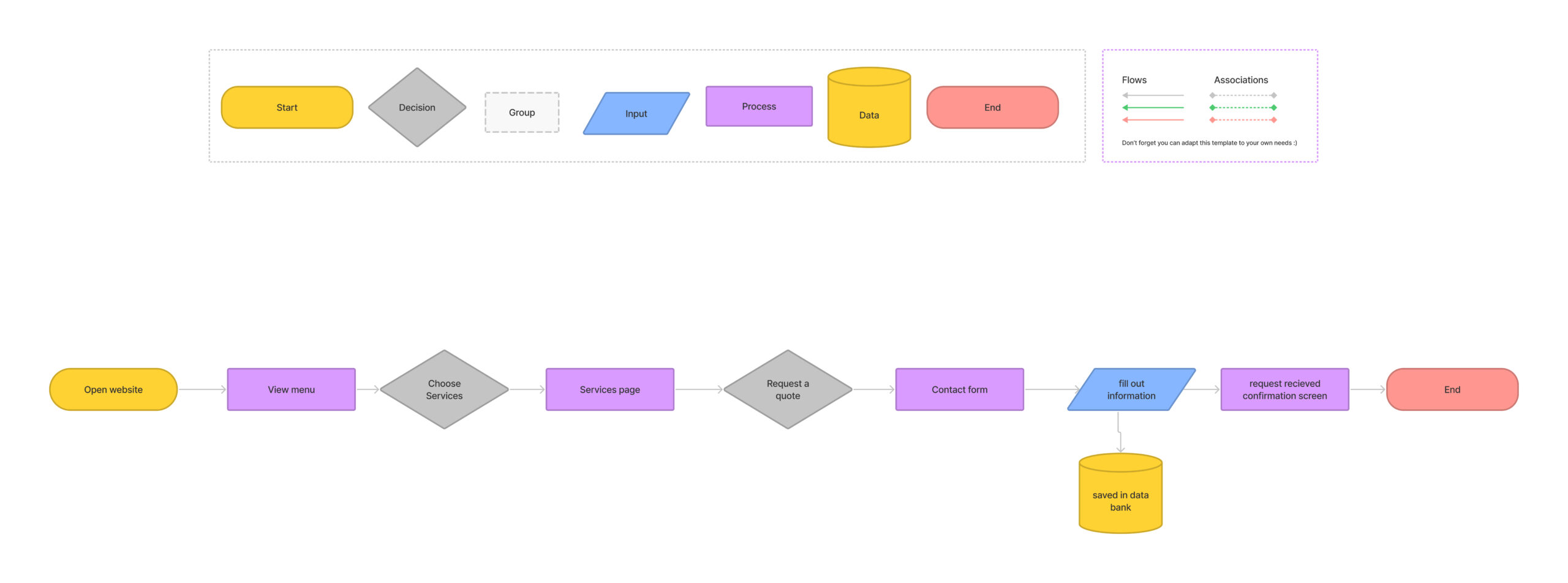
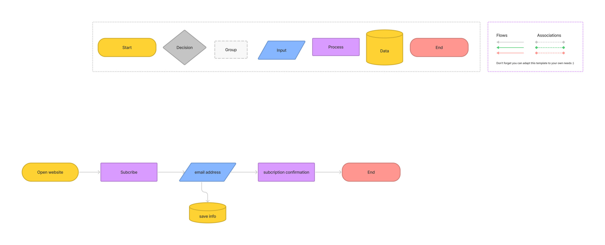
Task Flows Crafted for Seamless User Journeys:
With a solid foundation of information architecture in place, the design journey embarked on a dynamic evolution by shaping user experiences through task flows. Fueled by the insights from information architecture, these task flows were meticulously crafted using the versatile design platform, Figma.
Task flows are visual narratives that simulate the step-by-step journeys users undertake to achieve specific goals within the digital realm. Every interaction, decision point, and transition were strategically woven into these flows to ensure a coherent and intuitive journey for users.
By leveraging Figma’s capabilities, task flows were not merely static representations, but living blueprints of user engagement. Interactive elements, transitions, and micro-interactions were seamlessly integrated, allowing stakeholders to comprehend the user journey in an immersive and tangible manner.
This process fortified the design decisions, aligning them with user expectations, motivations, and pain points. As a result, the task flows emerged as a guiding compass, steering the design process towards solutions that promise to resonate, engage, and delight users at every juncture of their digital exploration.
Iterative Wireframing for Informed Design Direction:
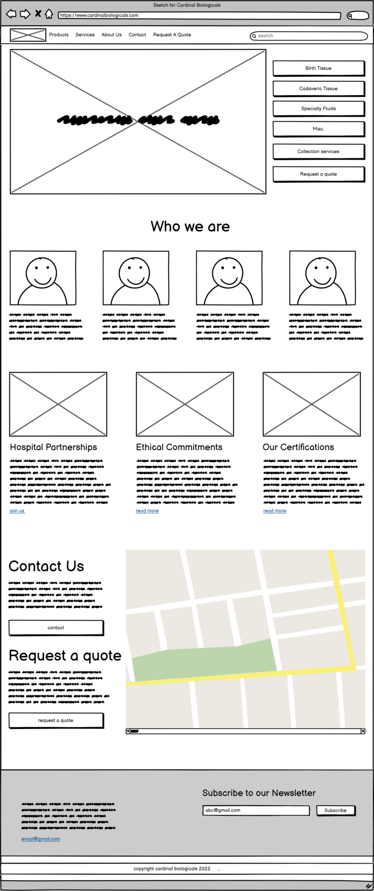
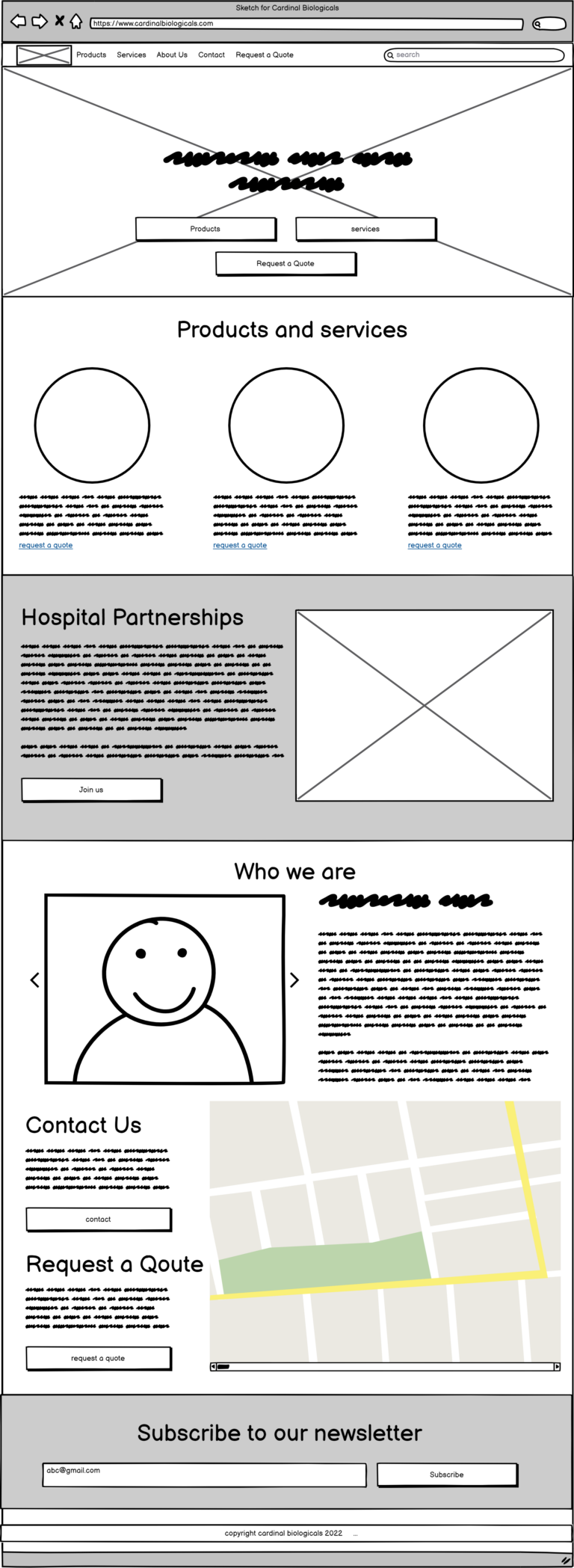
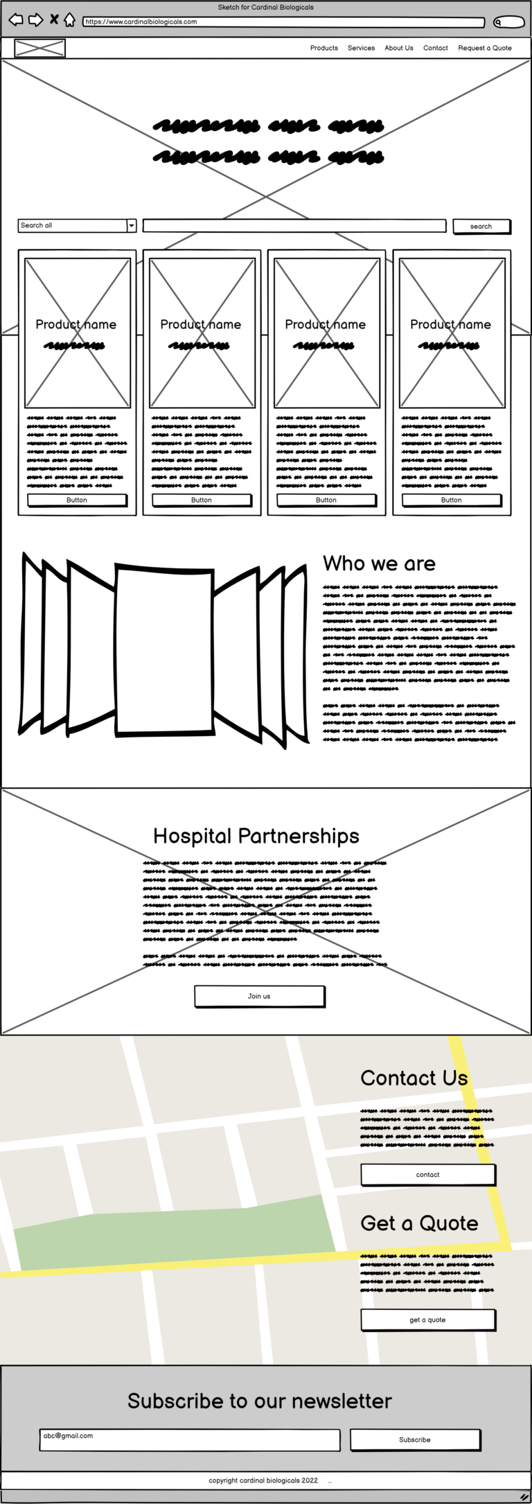
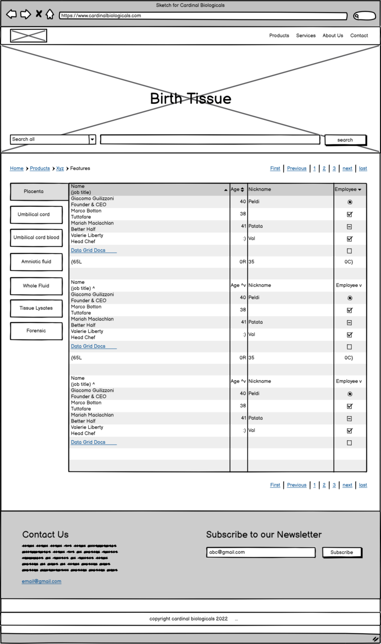
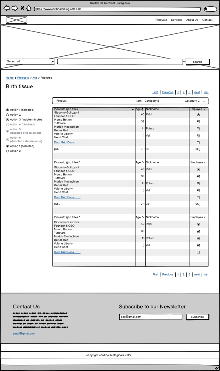
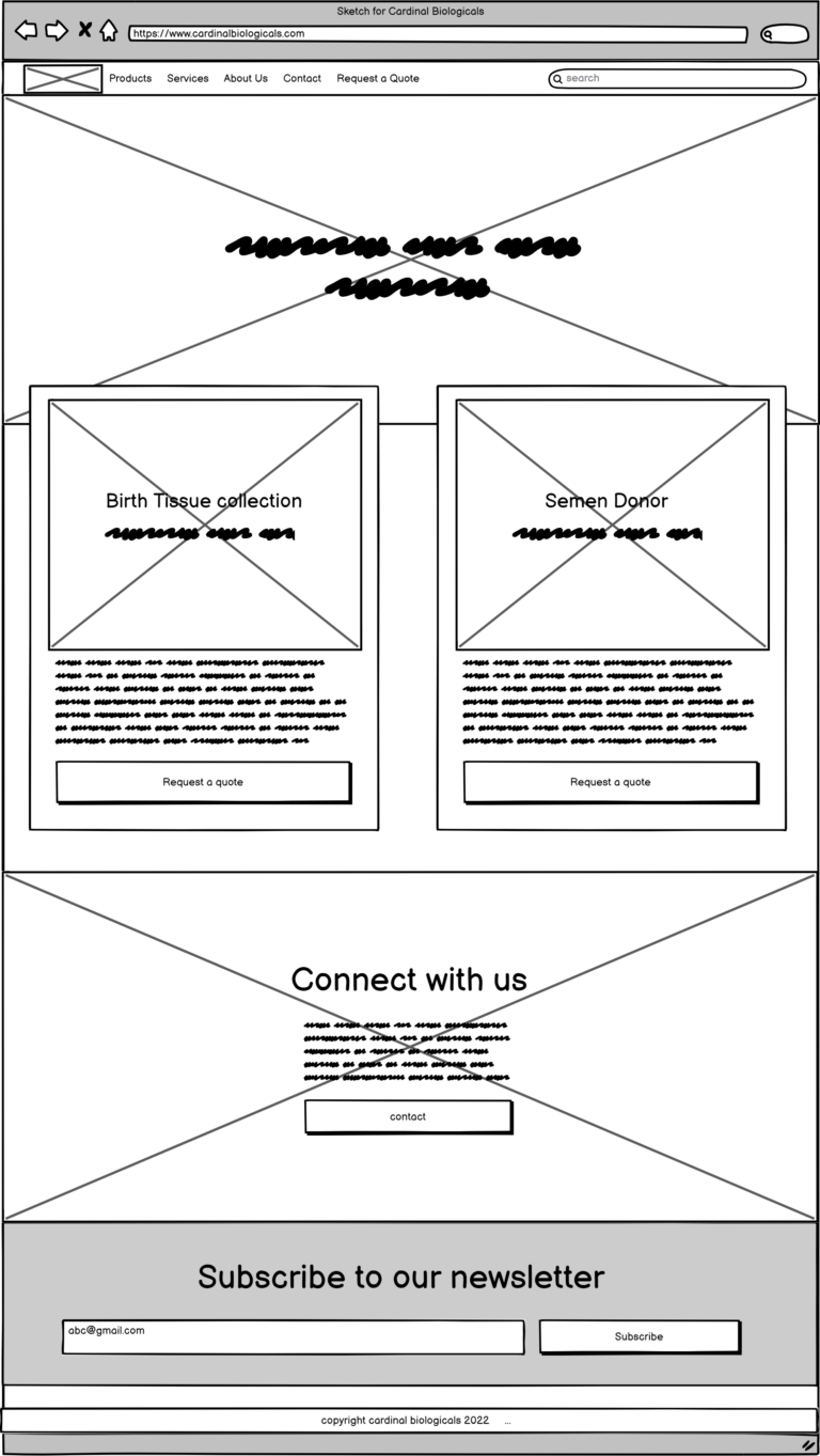
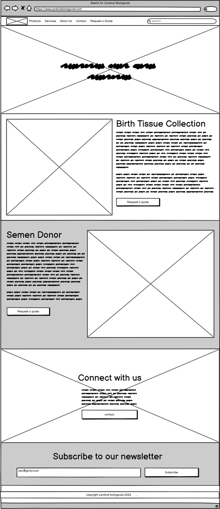
In the pursuit of translating conceptual visions into tangible digital experiences, the wireframing phase emerged as a pivotal bridge between ideation and execution. Harnessing the power of Balsamiq, a robust wireframing tool, a series of meticulously crafted sketches were brought to life – a visual blueprint that laid the groundwork for the website’s form and functionality.
These wireframes served as a rapid prototyping medium, allowing for swift collaboration with the client. Through concise and focused reviews, the client’s preferences and aspirations seamlessly converged, guiding the design trajectory with precision.
In addition to facilitating client interactions, the wireframes extended their utility to capture user insights. By presenting these skeletal representations to users, their invaluable feedback was harnessed, fuelling refinements that honed the user experience to a polished state.
Indeed, these wireframes played the dual role of a compass and a canvas, guiding the design compass towards the true north of user satisfaction, and providing an expansive canvas upon which collaboration, clarity, and innovation interplayed harmoniously. As the digital tapestry unfurled, the iterative wireframing process stood as a testament to design’s power to evolve, adapt, and continually elevate user experiences.
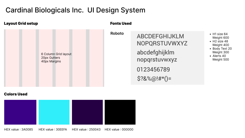
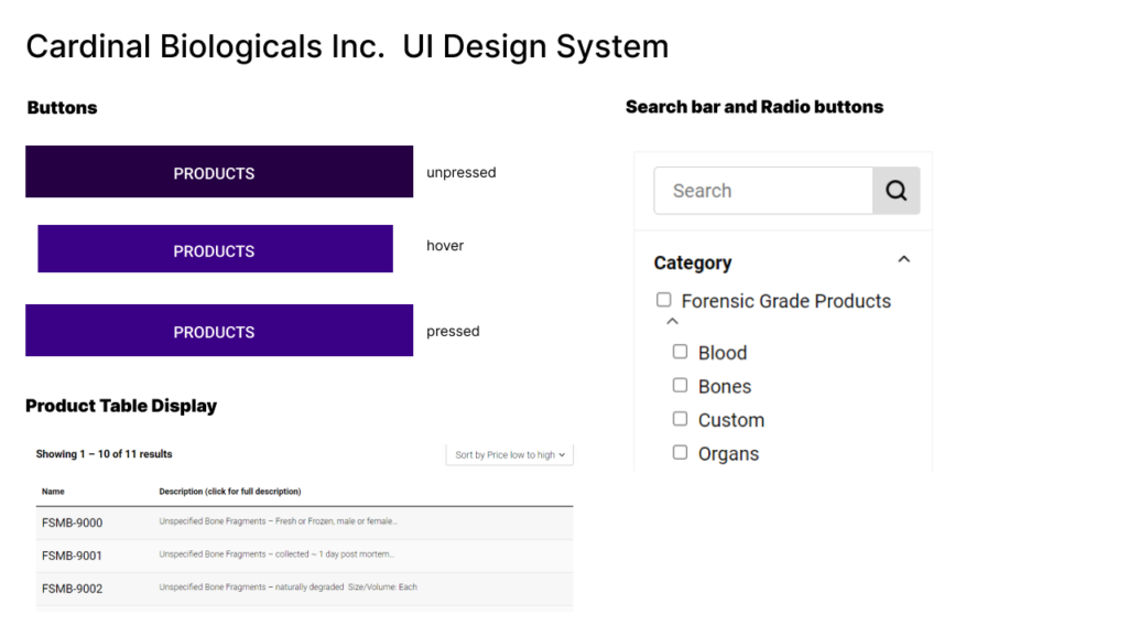
In the realm of crafting triumphant digital experiences, the synergy between user experience (UX) and user interface (UI) emerges as a pivotal cornerstone. With unwavering focus on the product’s essence and the end user’s journey, a design system was meticulously woven, encapsulating the ethos of simplicity and efficacy.
The foundation of this design system was strategically laid to cultivate a visual language that resonates effortlessly with the product’s core essence and the aspirations of its users. Embracing minimalistic color palettes and the timeless elegance of sans-serif fonts, the design system echoed a harmonious blend of aesthetics and functionality.
Within this meticulously orchestrated framework, every UI element was calibrated to forge a seamless interaction flow. From buttons to icons, from headers to footers, each component harmonized with the larger orchestration, encapsulating the product’s identity while nurturing a sense of familiarity and ease for the end user.
The outcome of this harmonious union was not just a polished interface, but a design system that inherently carried the user-centric DNA of the product. Through thoughtful choices, systematic alignment, and meticulous attention to detail, the design system emerged as a testament to the enduring power of simplicity and the profound impact it has on user engagement, satisfaction, and the holistic digital experience.
In the intricate tapestry of user experience and interface design, the choice to create a working prototype emerges as a cornerstone of my design philosophy. This deliberate decision is anchored in the profound impact that a tangible, interactive prototype wields in the design process. Allow me to shed light on why I chose to embark on this path and the transformative value it brings to every project.
Visualizing Concepts: A static design may capture visual aesthetics, but a working prototype transcends the static realm, enabling stakeholders and users alike to interact with the design as it unfolds. It serves as a conduit to visualize concepts, ensuring that the envisioned user journeys and interactions are not confined to the abstract, but materialize in a palpable and engaging manner.
User-Centric Iteration: A working prototype is a playground of possibilities where user-centered iterations thrive. By experiencing the design in action, users can provide invaluable feedback that guides refinements. This iterative process transforms feedback into actionable enhancements, allowing me to fine-tune the design to perfection while aligning it meticulously with user needs.
Enhanced Communication: A picture may paint a thousand words, but a working prototype weaves a compelling narrative. It empowers me to communicate design concepts effectively to stakeholders, fostering a deeper understanding of the envisioned user experience. This dynamic communication bridge ensures that design decisions are comprehended, embraced, and aligned with the project’s objectives.
Mitigating Risk: A prototype serves as a risk-mitigation tool, allowing potential issues and challenges to surface in a controlled environment. By identifying pain points early in the design process, I can address them proactively, steering the project away from potential pitfalls and ensuring a smoother transition from design to development.
Empowering Collaboration: A working prototype transforms collaboration into a vibrant symphony of ideas. It encourages cross-functional teams to engage with the design, fostering a culture of collaboration, ideation, and innovation. This collective effort propels the design to new heights, transcending individual contributions and culminating in a harmonious and holistic solution.
Validation and Validation: A prototype invites validation, offering stakeholders and users the opportunity to validate assumptions, interactions, and user flows. By validating the design early in the process, I can ensure that it resonates with the intended audience, reducing the risk of costly revisions later in the project lifecycle.
In essence, the decision to design a working prototype is a testament to my unwavering commitment to delivering design excellence. It is an embodiment of my dedication to creating not just aesthetically pleasing interfaces, but transformative user experiences that captivate, engage, and delight. Through this deliberate choice, I empower innovation, foster collaboration, and pave the way for a design journey that transcends imagination and brings visions to life.

