Creating Design Systems | Responsive Web design | User Interface | Requirements Gathering | User Experience

Being a Bio-tech company with a B2B sales model, Cardinal needed a rehaul of their website’s user experience and user interface.

The existing website design for the client’s medical products and specimens lacks clarity and effectiveness in communicating the business’s core focus, presenting relevant information, categorizing products, and facilitating seamless user interaction.
Specific issues include ambiguity in the landing page representation, redundancy and lack of actionable elements on the homepage, inadequate product presentation and categorization, inefficient information hierarchy leading to accessibility challenges, suboptimal visual elements, and a blog section with an undefined purpose. These shortcomings collectively diminish the website’s usability, visual appeal, and overall user engagement, necessitating a strategic redesign approach to address these deficiencies comprehensively.


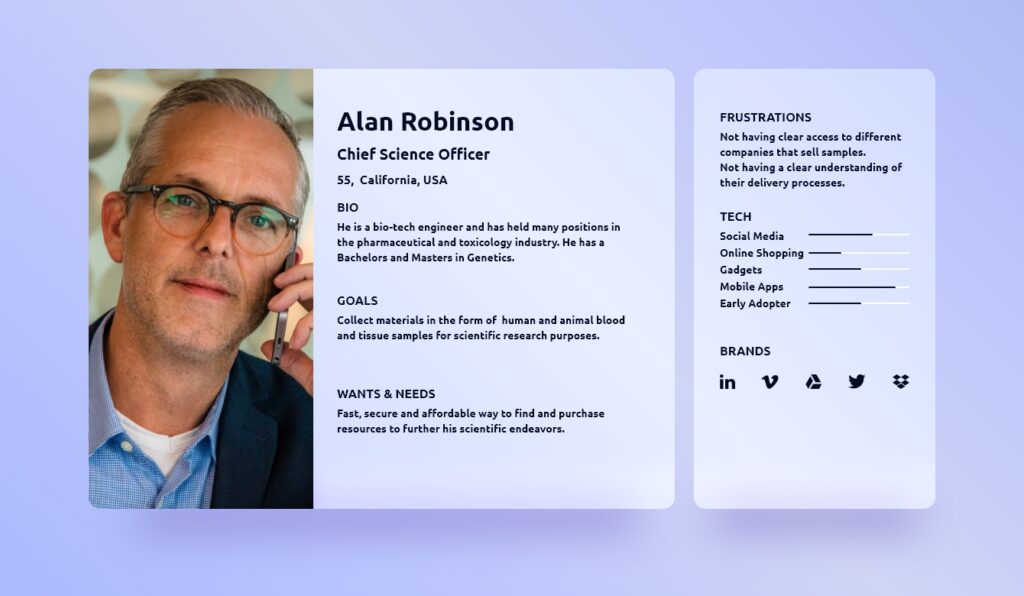
The development of personas emerged from extensive user research, informed by insights from user interactions, shaping a user-centric design approach. These personas encapsulate diverse audience motivations, preferences, and pain points, empowering a holistic understanding of user needs and expectations, influencing decision-making and ensuring authentic resonance with the user base. This comprehensive persona package has been provided to the potential purchasing company, enhancing their insight into Cardinal’s user demographics and behaviors, and facilitating alignment with their target audience.
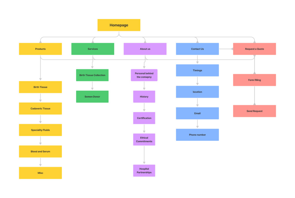
The website underwent careful categorization to enable comprehensive data mapping, ensuring a systematic representation of its extensive content. Each category served as a thematic container, improving navigational clarity and simplifying information retrieval for users. This methodical organization, centered on the user’s perspective, enhanced user engagement and clarity, creating a purposeful and user-centric digital environment.
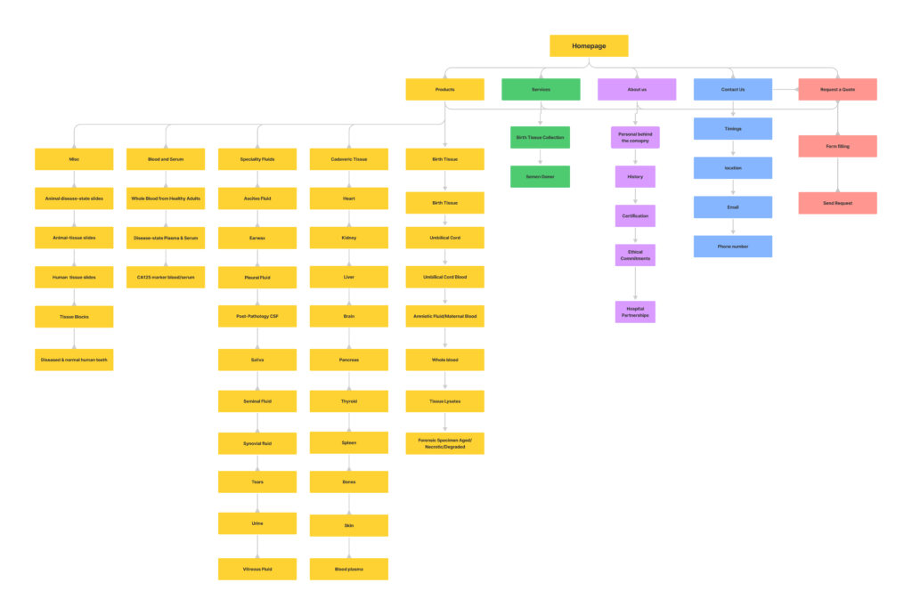
After establishing an initial organizational framework through website categorization, the next step involved a detailed refinement of data points to create a more intricate map. This process carefully dissected and rearranged content to reveal comprehensive information relationships. By delineating subcategories and subtopics, the refined map not only clarified content interconnections but also optimized user experience. Serving as a guiding tool for content placement and navigation design, the result is a dynamic web of information designed to empower users with a seamless journey through knowledge.
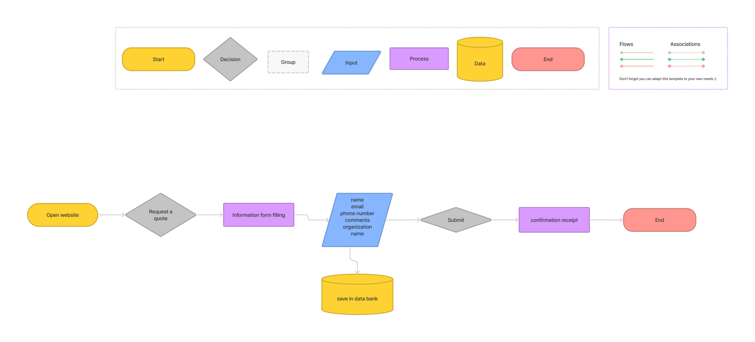
With a robust foundation in information architecture, the design process advanced by crafting user experiences through task flows. Informed by insights from the information architecture, these task flows were meticulously developed using the versatile design platform, Figma.
Task flows visually depict users’ step-by-step journeys to achieve specific goals within the digital realm, incorporating every interaction and decision point. Leveraging Figma’s capabilities, these task flows became dynamic blueprints of user engagement, integrating interactive elements and micro-interactions for stakeholders to comprehend the user journey effectively.
This process reinforced design decisions, aligning them with user expectations and motivations. Task flows emerged as guiding tools, directing the design process towards solutions that engage and delight users throughout their digital exploration.
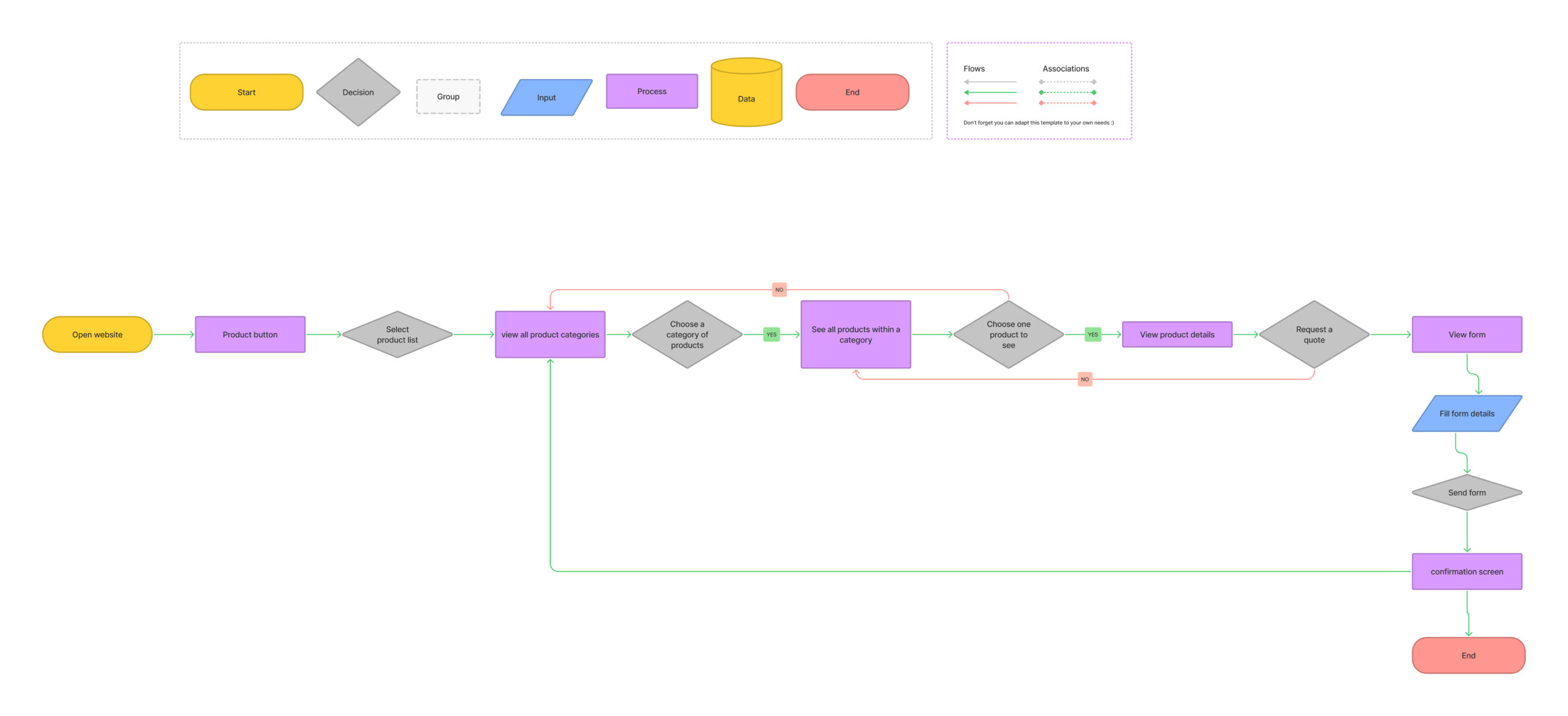
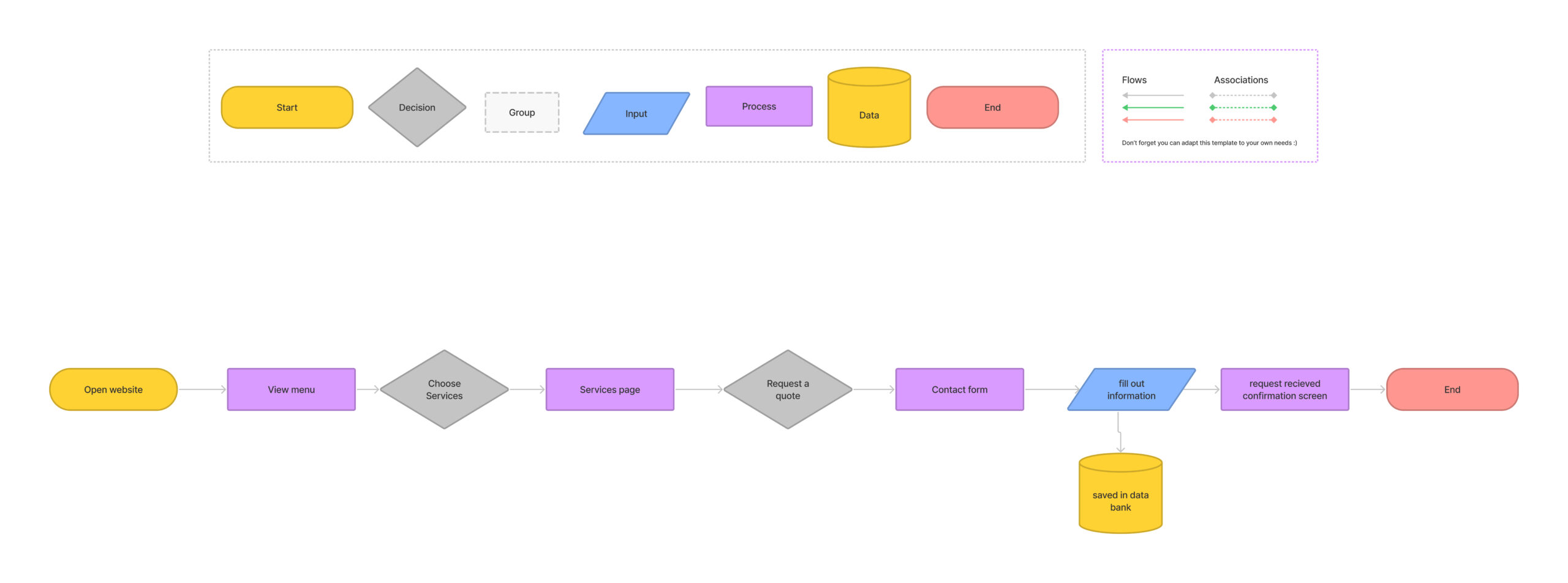
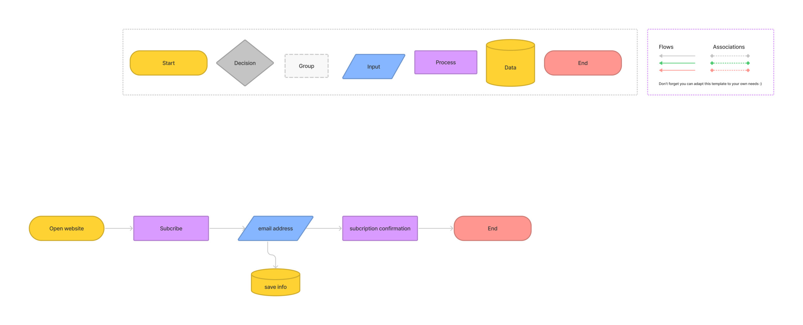
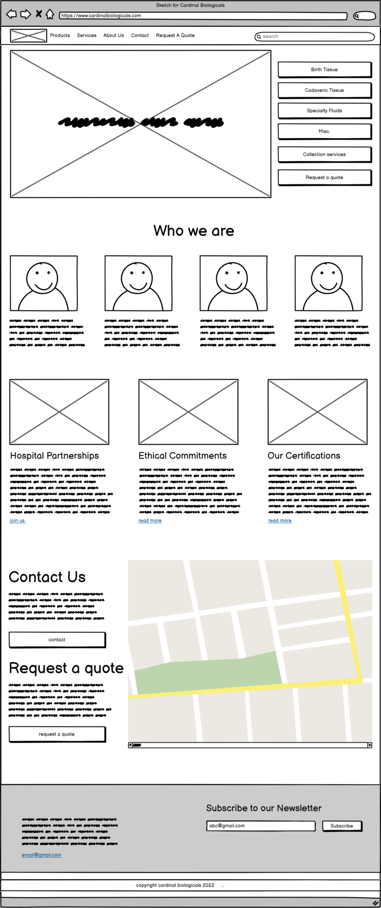
The wireframing phase served as a crucial link between conceptualization and execution, facilitated by Balsamiq. These sketches provided a visual blueprint for the website’s form and functionality, allowing for rapid prototyping and collaboration with the client. Through concise reviews, client preferences guided the design trajectory.
Beyond client interactions, wireframes captured user insights, refining the user experience. Acting as both compass and canvas, they steered the design process towards user satisfaction and provided a platform for collaboration, clarity, and innovation.
The iterative wireframing process exemplified design’s ability to evolve and enhance user experiences continually.
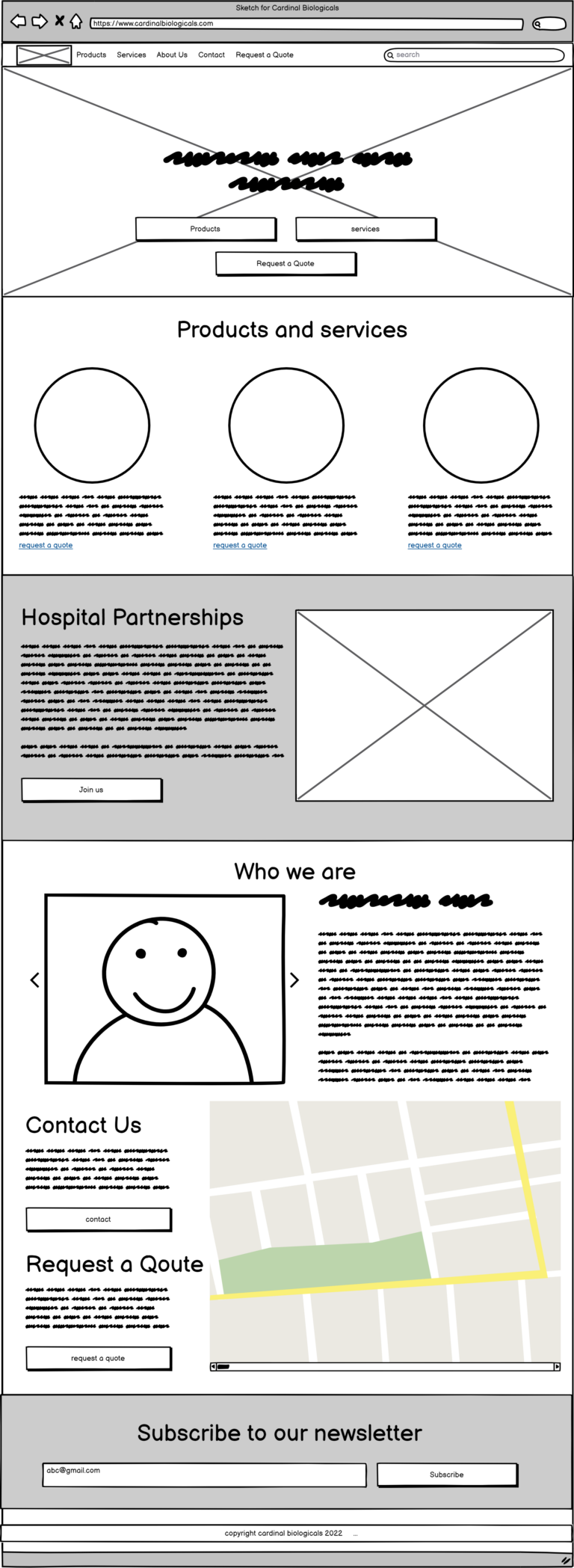
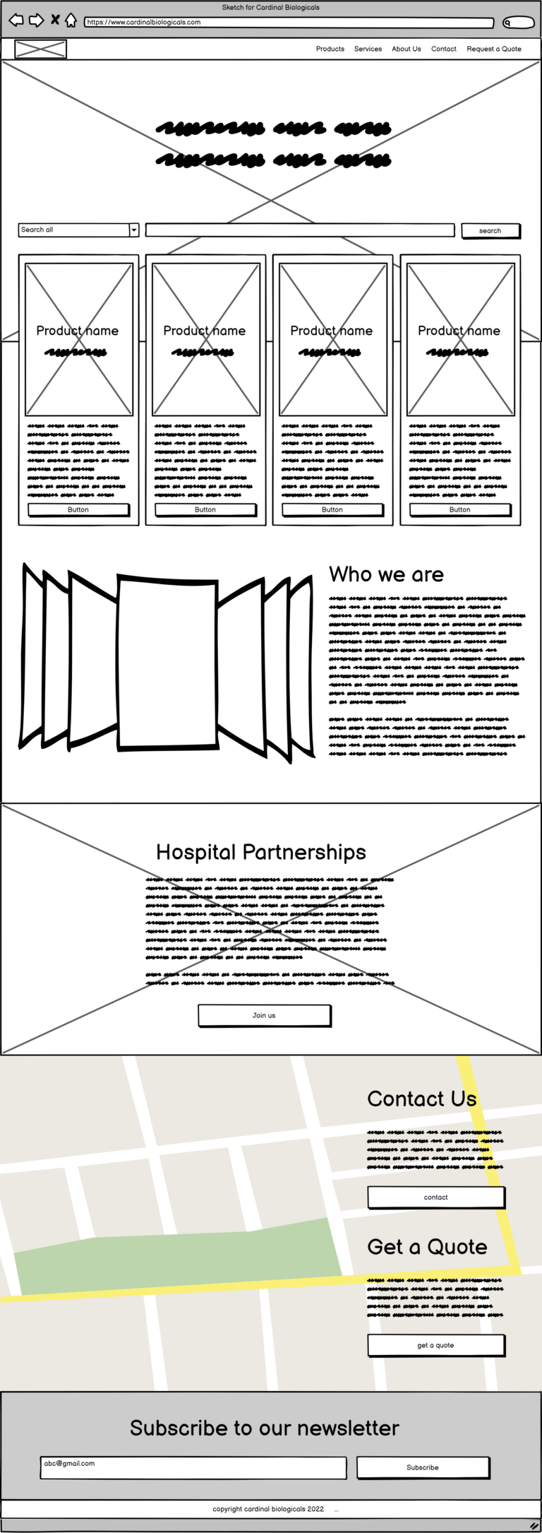
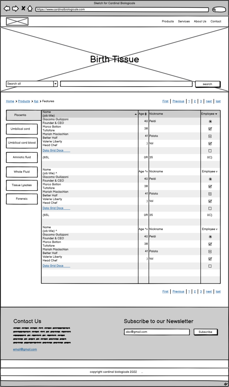
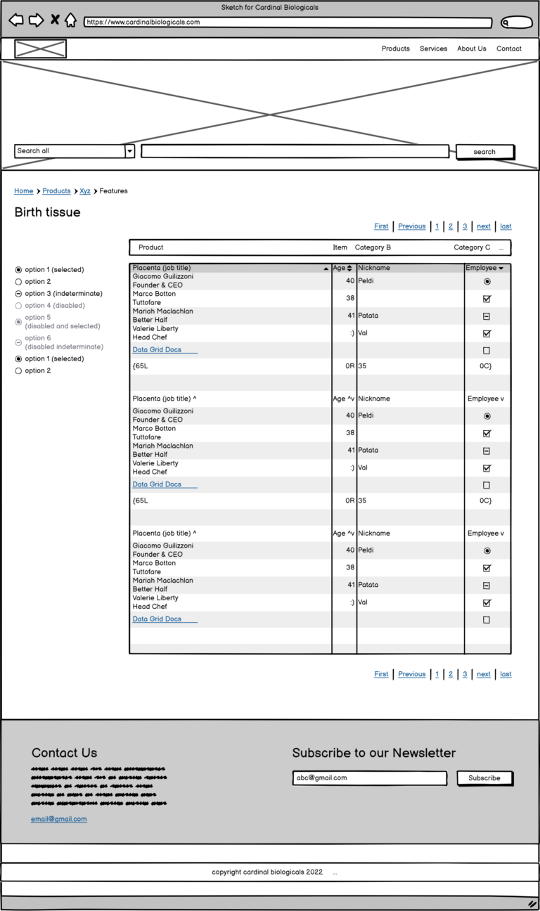
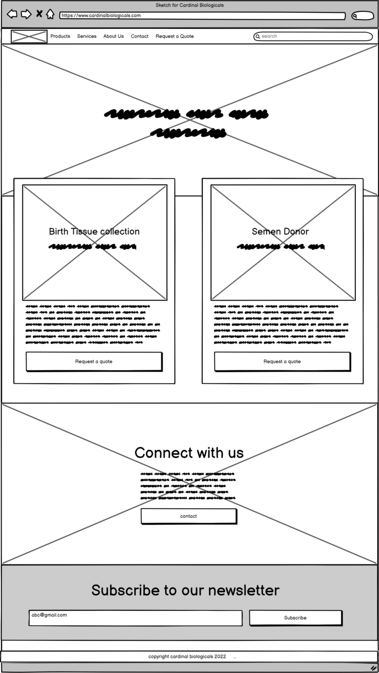
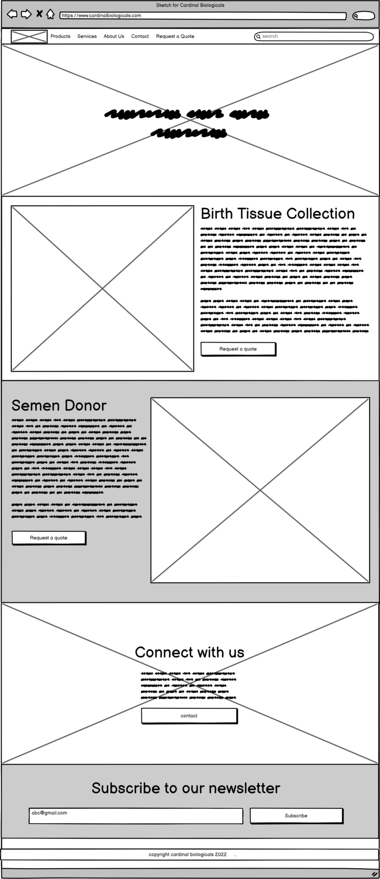
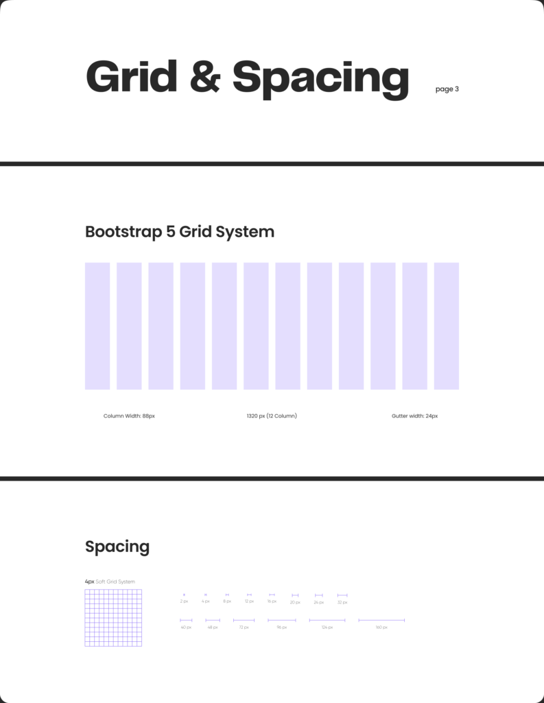
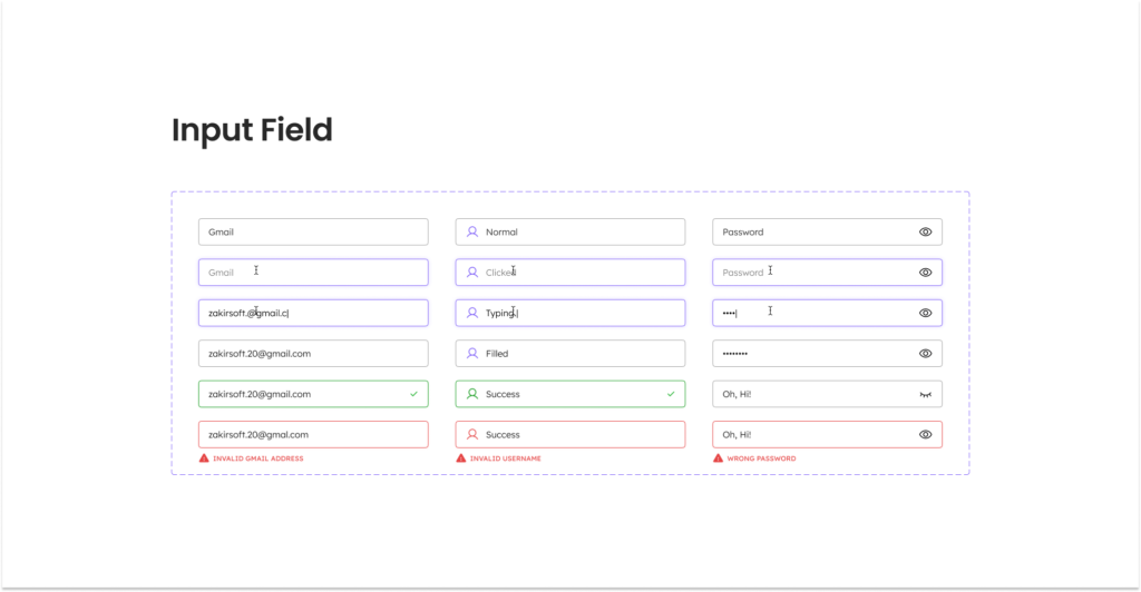
As the project, our aim was to blend user experience (UX) and user interface (UI) seamlessly. We developed a design system prioritizing simplicity and effectiveness, reflecting our essence and user journey goals.
Our design system embraced minimalistic color palettes and timeless fonts, ensuring a balance of aesthetics and functionality. Every UI element, from buttons to icons, was fine-tuned for smooth interactions, enhancing user familiarity.
Our result wasn’t just a refined interface but a system deeply rooted in user needs. Through deliberate choices and meticulous detail, we showcased the enduring impact of simplicity on user engagement and satisfaction.
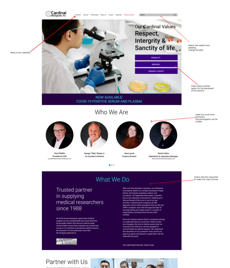
I created the Prototype using Figma and we started the user testing to get feedback. As you can see on the left there were notes left on the file and then those were taken back to edit and improve.
There were multiple screens created for the entire website and each went through this process of user testing to make it better.
The new Cardinal Biologicals website was launched in 2022. It has been in use for a year and the following data is from the feedback gathered in that year.
After running the website for almost two years we are in the process of updating the website and the user experience again.
This is being done after all the feedback that has been gathered in the last two years.

